Pages

Thursday, February 28, 2013

February Finish - Pinterest anyone?


It's the last day of February - do you think that maybe I should take down my Valentine's wreath?  I took this photo when we had the blizzard conditions.  Our front door is set back and usually my wreaths are safe from the weather.  People always ask where I got the heart shaped wreath, well...it didn't come as a heart shape.  I simply bought a round pink hydrangea wreath and squished it into a heart - quick and easy to do!

I have something a little different to share today.  Some of my blogging friends have participated in a Pinterest challenge over at the blog Young House Love.  The challenge is to actually do a project that is inspired by something that you have pinned on Pinterest - to follow through on the inspiration rather than just accumulating ideas on your boards.


Here are some of the fun projects that my friends have shared - I'll link to their blog posts with each description and you can check out the hundreds (566 as of last night!) of other Pinterest challenge projects on Young House Love HERE.


I learned about the challenge from the fabulous Monica Bradford of Scrap Inspired.  Monica made Disney autograph books for her two boys using a basic two-up 4 x 6 photo album.  She has lots of photos showing all of the pages of the albums on her blog HERE (click the "home" tab to go to her blog).  I have to confess I feel a bit behind the times - some of the Disney characters were new to me!


If you love to go to the Disney parks and want an easy way to scrap your photos from your trips you might be interested in Monica's Disney Album in a Snap class.  Monica's site is full of all sorts of inspiration and if you sign up for her newsletter she'll send you a list of inspiration sources that will certainly get you ready to move ahead with your projects.   Monica offers several other classes - click HERE to see the full list.


Beth at Scrapping Wonders used cookie sheets to make a magnet board and a chalkboard.  She made these magnets to go along with the boards - aren't they pretty?  You can see all of the details about her project on her blog HERE.  Beth also has lots of great tips about scrapping your phone photos and she reviews a phone app related to photo editing or crafting every week.

Debbie at Scrap-Me-Quick Designs did a cute project using zebra Cricut cuts as tags for baby shower gift bags.  You can see her project HERE.  Debbie loves die cutting of all types and runs a group on Facebook called Crafty Cut Ups - if you are a Facebook user you can find her group HERE.


Kristie at Artful Adventures also made a magnet board - hers is a more formal framed board.  I love the way she used buttons for the magnets and the paper she used to cover her board is just lovely!  You can see the details about her project HERE.  Kristie has started a podcast series called "Everyday Artist" where she interviews women from many walks of life who create art.  She also has lots of great projects - check out her chalkboard style scrapbook page.

Geezee at Messtaken Identity made an interesting mask using tulle and fabric paint.  On her blog she gives the link to the post with the directions she used to make it.  Geezeee explores ways to reuse things you might otherwise throw away for crafty purposes.  She offers kits for monthly Virtual Upcycling Parties
 
Cara at caramiller.com shared a recipe from her Pinterest board title "Yum!"  She made pesto and cheese stuffed chicken - and then made a digital scrapbook page to record her results.  You can see her page HERE.  Cara teaches Cricut and Cameo classes at My Creative Classroom (see her classes HERE).  Her new love is digital scrapping.  She is starting a beginner digital scrapping class called "Ba Da Bing" - easy peasy digital scrapbooking using Photoshop Elements 11.  The class launches March 1st and you can check it out HERE.

Are you a "pinner" or a "doer"?  If you have lots of projects that you'd like to try maybe this weekend would be a good time to choose one and do it.

I have been busy with paperwork for my Dad's estate and I wasn't able to get a project together to participate in the challenge this time but I understand that Young House Love organizes this challenge four times a year.  I may have time to look through my Pinterest ideas and try a project for the next one.  I hope you have fun checking out these projects - if you get through the over 500 links you will be incredibly inspired - and exhausted!


Subscribe to Capadia Designs if you would like to have new posts delivered directly to your email. Share/Bookmark

Tuesday, February 26, 2013

Vintage Hybrid Cards for St. Patrick's Day


When you have a great digital image and apply some creative design techniques to it you can make unique and special cards for any event or holiday.  The designs can be printed and cut and then layered on a conventional card base and embellished.  This is a good way to speed up the cardmaking process when you need a group of similar cards.


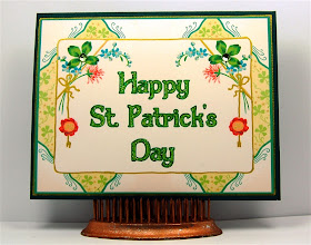
I was looking through some floral images at Twisted Papers and I found one that appealed to me for a St. Patrick's Day project.  This image is not in the St. Patrick's Day category but the four leaf clover images made it seem appropriate.  you can find this image on the site HERE.

Technically, a shamrock has a compound leaf of three leaflets but you'll often find both three and four leaf shapes used to make a "shamrock."  If you don't have a shamrock cut or punch you can create one with three hearts and a bit of a stem...


I brought this image into the Silhouette Studio software by simply dragging and dropping it on to the mat.  I wanted a more symmetical card design so I used the "mirror right" command in the replicate menu to create the image seen above.  I could print this as it stands and add a sentiment on a raised shape in the center. 


I decided to try to make a better place for the sentiment directly on the card front by adding some rectangular shapes and using the "eye dropper" in the fill color menu to sample the surrounding color for each shape.


I adjusted the size to 4 x 5 1/4 inches to layer on a standard A2 card.  Then I printed two copies of the design on an 8 1/2 x 11 piece of white cardstock.  For some reason my print and cut registration mark on the top right was not printing properly.  It didn't matter for this project since it was quicker and easier to simply use a trimmer to cut the card layers. 


I added the sentiment using the "Dumbledore" font and created an offset to shadow the words and a darker shade of green.  You could choose to cut the words and layer them on the card front but it is definitely quicker to print them.


I added Stickles in the "eucalyptus" color to highlight the words.  The effect of the sparkly glitter makes any card seem special.


 I wanted to emphasize the gold frame and bows around the center medallion and I tried three options.  The liquid pearls add a lot of dimension but I had a hard time getting a smooth line along the edge.  The Smooch gold metallic has a wand and deposits a beautiful glowing ink but this was also a little tricky to manage.  I found that my gold Uni-ball gel pen was the easiest option for me.


Adding the gold ink gives a subtle glow and definitely makes the card seem more finished compared to a plain printed card front.


 In addition to inking the gold parts of the design, I ran my gold pen around the layer of cardstock to create a shiny edge on the card.  Little finishing touches like this can add a lot to the look of the final project.


For a little more sparkle, I added a light green sticky backed gem in the center of each large four leaf clover (or shamrock).


If you are going to mail a card with these gems, be sure to add a protective piece of thick cardstock or light chipboard to keep the gems from rubbing through the envelope.


You could also print this layer and then trim out the center on a second print and add it to the card popped up with some foam squares for more dimension.


I used the Silhouette Studio software to create my St. Patrick's Day card fronts but you can use many programs to achieve similar results.  This card was simply resized and printed four up on a page (see the full post HERE).

The images from Twisted Papers cover a wide variety of holidays and interests.  They are very high quality  and can often be used a larger sizes.  Most images cost just $1 and there is a super subscription plan that allows you to download up to 500 images in a 30 day period for $24.95.  They also have a Facebook page HERE and a newsletter and sometimes they will offer free images to followers and newsletter list members.


Once you have created the design, you can make lots of simple and pretty cards.  Do you send cards for St. Patrick's Day?

I hope that some of you were able to take advantage of the one day sale on  Scrapinars yesterday.  If you didn't get to read about the offer until it was too late, I am sorry.  I had to try a few times to get the email notice set up to go out in the afternoon.  If you are in one of the areas affected by the big snowstorms, please stay safe and warm.


Subscribe to Capadia Designs if you would like to have new posts delivered directly to your email. Share/Bookmark

Monday, February 25, 2013

Special Sale Notice (and a sneak peek)


Happy Monday - I hope you had a great weekend.  I am still catching up from my trip and didn't get a chance to post late last night as I usually do for those of you who get the early morning email.  I do have something quick to share that is time sensitive so I changed up the schedule a bit.

Did you watch the Academy Awards last night?  I got an email from Lain Ehmann this morning.  If you remember the little birthday gift I made for her (HERE) then you know that she is a huge Hugh Jackman fan.  Well... in Lain's opinion Hugh was ROBBED and so she is holding a vigil in his honor and offering a buy one, get one free offer on all nine of last year's scrapinar videos.  These scrapinars cover a variety of topics - here are the titles

TAKE AMAZING PROJECT PHOTOS with NICHOL MAGOUIRK

CREATE PERFECT CUSTOM PHOTO BOOKS with MELISSA SHANHUN

WASHI TAPE WAHOO with MONICA BRADFORD


SCRAP LIKE THE WIND with LAIN EHMANN

GETTING ORGANIZED FOR PROJECT LIFE with JENNIFER WOODBURY


Click HERE to view more details about each scrapinar
  • Offer runs from now until midnight Pacific tonight (Monday)
  • Enter code ROBBED at checkout to get half off the purchase of any two 2012 Scrapinars.
  • The coupon can be used more than once by a single customer, but you must go through checkout a second time to get the discount again. 

March is almost here and it's time to be creating St. Patrick's Day projects.  I'll show you how I used a vintage image from Twisted Papers to create a pretty card - the sneak peek is at the top of this post...

Have a wonderful day!

Subscribe to Capadia Designs if you would like to have new posts delivered directly to your email. Share/Bookmark

Friday, February 22, 2013

A Quick Tip for Paper Shopping


Happy Friday!  I have been away for a few days and will be driving home today - just in time to get ready for our next major snowstorm.  Is anyone else hoping that Spring will arrive soon?

I have another super quick tip for you today.  If you love to buy paper (and I think most of you share my paper addiction...)  be sure to check both sides.  More and more papers are manufactured as double sided papers.  In most cases one side is the "front" with the bolder or more thematic design for the paper line.  The other side (the "B" side) is often a solid, a more subtle pattern or coordinating small print.

I love to go to my local store to see and buy the latest papers - who can resist something fresh and new?  However, I often find last season papers at stores like Tuesday Morning, Marshall's or T.J. Maxx.  Sometimes they are sold in stacks but you are also likely to find packs of 25 or so sheets of the same paper.  The price can be very low ($3.99 or even $1.99 for 25 sheets of paper or cardstock that originally sold for about $1 a sheet).

Of course, unless you are teaching classes or making kits, you might not want 25 sheets of the same paper.  You can get together with a friend or two or three and split up the paper packs to get a nice variety of options.  If you like to make mini albums or sets of cards you might want to keep the entire pack of paper for your own use.


This is the "front" of the paper that I used for the anniversary card I shared a few days ago.  It is a pretty shimmer paper but the front side is clearly meant to be used for a wedding layout.  I don't think I would use this side of the paper more than once or twice...


However,  I really like papers that shimmer so I was thrilled to see the back side of this paper.  It has a pretty overall design that I can use over and over.


This is the "front" of another paper.  The pink flourish limits the usefulness of the black and white dot design.  I probably wouldn't use the full sheet of paper very often but I might trim it down to use small sections of the dotted design.


On the opposite side of the paper is this lovely pink damask style design.  This side would be more useful for me so I bought the pack of 25.


It is also a good idea to take a careful look at the seasonal papers that are often marked down significantly after the holiday has passed.  I just bought this K & Company 12 x 12 paper pad for 70% off.  When I flipped through the pages I found that there were many pieces with one side that could be used for more than Valentine's Day projects.


This is the front of one paper - I like it but wouldn't use it often...however...


...the bright red background filled with colorful dots on the other side would be very useful.


Here is another page - front (above) and back (below).


This is another more "generic" option and I like the option of having more than one colorway of a design.


The red and blue dotted papers could be fun to use together.


Here is a final example - the bold circus style "XOXOX" design on the front limits your options..


and the tiny pattern on the back side is much more versatile.


The pattern looks like tiny dots but it is actually tiny hearts. 

The biggest problem I have with double sided papers is that sometimes I like both sides equally - and then it is hard to decide which side to use (so I end up hoarding some of those papers).  Do you like two sided papers or single side prints better?

I hope that you are snug and warm and that this next snowstorm is not too challenging.  Our son and his girlfriend are due to fly home during the storm so we are keeping our fingers crossed that they won't have serious delays...and considering the possibility of living in a more moderate climate!


Subscribe to Capadia Designs if you would like to have new posts delivered directly to your email. Share/Bookmark

Tuesday, February 19, 2013

Personalized Pop-Up Anniversary Card


My husband's parents celebrated their 58th anniversary last month but I didn't get a chance to give them the card until recently.  This card uses both Cricut and Silhouette files.  It is a large card, 6 x 6 inches.

The "Happy Anniversary" on the front of the card is from the Martha Stewart Crafts Elegant Cake Art cartridge.  It is on the phrase feature key and can be found on page 69 of the handbook.


Here is the inside of the card.  I used a file designed by Samantha Walker that I purchased from the Silhouette Online Store.  I made a few changes to personalize the card.


Here is the design ID information to make it easier for you to find this card.  I really like pop up cards and intricate designs so this was almost perfect for the special anniversary card.


 I wanted to have room to add initials and the anniversary number so I eliminated the cut out hearts in the center and at the top.


Deleting the three hearts gave me a spot to add the letters and numbers needed to personalize the card.  Here you can see the difference between the modified and the original card insert.


I used "verdana" - a very plain font for the letters since the area was quite small.  I usually put the name of the font I use in the gray working area of the file so I can remember later.  I used the knife tool to fix the "B" and the "8" so the center pieces would stay connected.  (I will show how to do this in more detail in another post).


The tiny letters and all of the intricate details cut beautifully in the Cameo.  When the card insert is folded you need to be careful not to rip it along the folding perforations.


The file contains a cut for the card base but I just cut a piece of cardstock at 6 x 12 inches with my trimmer and then scored and folded it to form a 6 x 6 inch card.  I put adhesive on the bottom section and placed it carefully in the card base aligning it with the center fold.


I used ScorTape and placed it along the outer edges of the insert, then peeled off the backing and folded the card base down on the insert.  This helps to keep the pop up from tearing from stress when the card is opened.


Along the bottom of the insert I added some punched hearts.  I used the same patterned paper that is on the front of the card as well as the dark red cardstock I used for the sentiment.  I was careful to punch the three hearts from the patterned paper at the same spot in the design so they would match.


The paper on the front is a shimmer paper - hard to see in the photo but very elegant in person.


I needed to make an envelope for the card since I didn't have one to fit a six by six card.  I used some embossed white cardstock and added a few more red hearts on circles of the shimmer patterned paper on the front of the envelope.


On the back of the envelope, I used a patterned heart on a red circle for the closure.


I made the envelope by simply folding the sheet of white embossed cardstock around the card and trimming away the excess pieces.  The envelope ended up rather asymmetrical (I didn't measure or try to be precise) and I liked the way it looked.  I'll try to explain in more detail how I made the envelope fit in another post.  I didn't have time to take photos as I made it.


Here is one more photo of the center of the card with the letters and numbers added.  While this might have been meant for a Valentine's Day card, it worked perfectly for an anniversary card with the extra personalization added.   I kept the front of the card very simple to emphasize the special surprise inside.

Do pop-up cards always make you smile?  I just think they are a little bit of magic and would be sure to brighten anyone's day!

If you had President's Day off I hope you enjoyed the long weekend.  If you are on vacation this week, have a great time.  I need to take a quick trip to Pennsylvania to take care of some things for my father's estate.  I am trying to keep up with answering email and comments but I am a bit behind - if you have sent me a question recently I will get to it as soon as possible but for the next few days I won't have much time online.

Subscribe to Capadia Designs if you would like to have new posts delivered directly to your email. Share/Bookmark