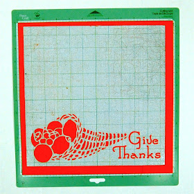
I like to keep scrapbooking simple. When I look at the very elaborate pages with layers and layers of embellishments I have trouble finding the photos. I like the page to support the photos but to stay part of the background so the story and the photos are the most important things on the page.
When I make cards, I often create a design that cuts an image into the card front. I decided to start making some page backgrounds using the same technique. I bought this book of Floral Stencil Designs from the new Dover Pictura site. It has lots of great images that are simple to trace with the Silhouette Studio software and turn into cutting files (other programs that allow you to trace a shape will also work).
After I created the file I cut the page, using a double cut to be sure that all of the fine details would cut cleanly. As you can see - it cut perfectly (yes, I do use my Cricut mats in my Cameo sometimes - I have lots of them and they work just fine).
I set the file up to cut the page at 11 x 11 inches to allow for a background paper to make a border. I adhered some brown paper behind the cut and then experimented with various papers for the outer border.
This is a very dark green textured cardstock...a bit too dull...
This medium green has more life - but it is also a solid. I decided to try some patterned papers.
I bought this stack on clearance last year. It is a Halloween stack but the are some pages that are just overall patterns with no bats or pumpkins.
I liked this subtle yellow herringbone page - it is hard to see in a photo but the texture is obvious when you look at the page so it doesn't seem as solid as it looks here.
This plaid gives it some real zing!
I think these pages will make quick and easy projects. The paper choices can give very different looks. You could try a small patterned paper behind the cutouts or just use two layers instead of backing the openings with a third color or pattern.
I am excited to try cutting more of these designs. I have quite a few already set up on the computer but i won't have a chance to cut any more or add photos to this page until next week.
What do you think of this type of page? Are you a "flat scrapper" like me or do you prefer lots of lumps and bumps on your pages?
We are off on a short trip this weekend - I'll tell you all about it when we return. I plan to have posts set up to publish while we are gone but if something doesn't work out it's only for a few days. Have a great week!
Subscribe to Capadia Designs if you would like to have new posts delivered directly to your email.


I like this idea - I am going to have to try this with my Cameo! I like a combination of pages, but generally they are fairly flat. There are sure a lot of options with this type of cut, though...
ReplyDeleteI learned to scrapbook with Creative Memories so I am a flat and simple with journaling kind of a girl when it comes to layouts.
ReplyDeleteCards and other crafts are a different story ~I love all the different embellishments and now have a place to use them!
I can't go too crazy since almost all of my cards go to Operation Write Home {No Glitter & not too thick}
I think this is lovely. And I agree with you - I like the elements of the page to be the supporting cast and not to outshine the stars (photos). Maybe someday I'll own a cameo...
ReplyDelete