Pages

Sunday, September 30, 2012

A Busy Weekend


We have lots to do this weekend so no crafty post today.  The weather has been dull and rainy here.  In case your weather is similar, I thought I'd share this photo of a flower growing in our friend's garden in Italy.  Just looking at the bright colors and the sun will chase the cloudy day blues away!

Have a great Sunday!


Subscribe to Capadia Designs if you would like to have new posts delivered directly to your email. Share/Bookmark

Saturday, September 29, 2012

Designs in the Details


It started raining Thursday night and I don't think it has stopped.  The forecast is for rain all weekend - so it will be a good time to get things done around the house.  I have a few more photos of interesting things I saw in Italy to share.  This doorknocker is a little odd, in a charming sort of way.  I like the beaded background octagon and I think it would make a great frame.  I have a lot of photos of doorknockers that I have taken over the years and I am thinking about making them into a poster to frame.


This letter slot also has an attractive frame and some interesting swirls.  It was set into a large rock wall with nice colors and textures.


The most elaborate frame by far is this "Farmacia" signThe shape would be easy to recreate but the dragon-like creatures at the top are much more complicated.  Look around as you are out and about - I am always surprised at how many design ideas are right under our noses.


Between laundry and other chores on Friday, I spent a little time in my craftroom and made this test cut of another stencil design from a Dover image collection.  I altered the shape a little to make it fit on a 5 x 7 card.


I cut the card with my Cameo and used a double cut on this thick shimmer cardstock.  The cut was nearly perfect but a few spots needed to be "encouraged" to separate.  I think it may be time to change the blade on my machine (I am still using the original blade and I have cut many projects).   I'll show the finished card and more details soon.

A little enabling...


This weekend is the last chance to buy the Artiste cartridge and get both the Stamp of the Month and It's Your Day, the special double stamp set for National Stamping Month pictured above (until September 30th).  You can get the cartridge bundle with the chipboard and the three included stamp sets for $99 and add the extra sets for just $10 more ($5 each) for a total of $108 plus tax and shipping.  This bundle can only be purchased through a CTMH consultant and my friend Melanie Brown would be happy to help you with any questions.  All of the details are on Melanie's blog HERE and you'll find the bundle on her Close to My Heart website  HERE.

A little more enabling...

Its Fall Yall Sweepstakes

Dollar Days are back at Lettering Delights.  This is a great time to stock up on their digital products at a bargain price.  They are also running a sweepstakes to win a Bind-it-All prize package worth over $100.  The contest is on Facebook HERE. Just click the image above to start shopping!  There are some special codes to help you save even more.  You can save 30% off a $20 or more purchase with the coupon code: SaveBushel and save 40% off your $50 purchase with the coupon code: Save Barrel.

I hope you have a wonderful weekend!

Subscribe to Capadia Designs if you would like to have new posts delivered directly to your email. Share/Bookmark

Friday, September 28, 2012

Back from Italy


Happy Friday - have you missed me?  After nearly four years of daily posts - I took a break for a week!  As I posted last week, we took a quick weekend trip to Italy for a reunion with some friends and former work colleagues.  This group has met every two years since we left England 12 years ago.


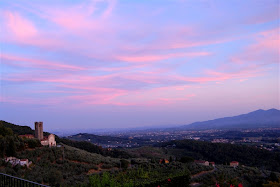
Our American friends live in a lovely part of Tuscany, near the old city of Lucca.  The scenery is wonderful and we were fortunate to have good weather while we were there.


Lucca is a walled city as you can see on this street map.  It is one of the few that still has a full intact wall from the Renaissance era.  If you look near the top center of the yellow area, you can see the oval area that is the Piazza dell'Anfiteatro.


The Piazza is surrounded by buildings that form an oval shape with shops, apartments and lots of cafes in the center.


While we were in the Piazza, a bride and groom were having some photos taken - her gown was beautiful.


We were in the Anfiteatro to meet the Segway rental company.  We had an adventure with six Segways and a special bicycle cab that is built for six!


We rode from the Piazza up to the wall and then drove all the way around the city. Riding the bike is a little tricky - only the people in the four corners can pedal and, even though there are two steering wheels, the one on the left is the only one that controls the cab.


From the wall you have a view over the city and on to the surrounding hills (more like small mountains!).


There are many, many churches within the walls - I have forgotten the exact number but it seems disproportionately high for the size of the city.


Some of the churches have very elaborate facades.


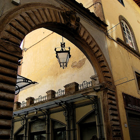
The stones used for the arches alternate in color for a checkerboard effect.  I love to see all of the architectural details and often can find ideas for paper cutting designs from buildings.


The stones and ironwork are fascinating to see and of course I took lots of photos to help me remember some of the ideas.


There are many examples of intricate iron work - this is the base of a lamp post on the wall.


Here is the top of the lamp post with all sorts of fanciful animals set into the curves and swirls.


The wide paved area on the top of the wall was perfect for riding the Segways.  It was the first time most of us had tried this and it was a lot of fun after about a ten minute learning curve.  I definitely want to try it again - maybe in Boston.


I had to laugh when I saw the name of the cycle rental company - I checked a translator and it does have the same meaning as the English word bizarre!


There is always so much to see when you are in another country.  I think the glass holders around the window are for candles but I am not sure when they would be lighted (I am guessing that it would be in connection with some sort of religious festival).  The fleur-de-lis ironwork also caught my eye.


The site in the shop windows are also intriguing - look at all of the yummy flavors of gelato...


I don't know how anyone could walk on the cobblestone streets in these shoes but I am sure that some people try!


The shops have lovely displays and in this one the merchandise spills out from the building into the piazza.


I have taken many photos of the ironwork in the arches over the doors on previous trips so I only took a few this time.  I thought the reflection of the other buildings was very pretty in this photo.


When we returned to the States, I had a fairly major bout of jet lag and I decided the best way to get over it was to take it easy for a few days.  Some packages arrived while I was gone and today I will be trying out some of these recent purchases, including lots of punches.

So what's new with you?  What sort of projects are you working on?  Do you decorate for Halloween - a little or a lot?  Do you send Halloween cards (I make them but hardly ever send them!).

I have a few surprises planned for next week.  I hope you have a great weekend!


Subscribe to Capadia Designs if you would like to have new posts delivered directly to your email. Share/Bookmark

Thursday, September 20, 2012

Weekend Away


The sky was a beautiful bright blue on Wednesday as we got ready to leave on our trip. I had planned to set up some project posts for the days that we are away but my laptop had other ideas...

So the crafty posts will have to wait until I am home again and can get my computer sorted out. I thought I'd try posting from my phone (trying to keep up with the mobile age and learning new things).


We are in Italy for the reunion with friends and former work colleagues from our time living overseas. Jet lag and odd sleep patterns left me awake enough to try this while everyone else is sleeping...

I thought I'd try to post a photo (or two or three) each day and share some of the wonderful things we always see and do here. It looks like the weather will be lovely and we are looking forward to seeing the rest of the group as they arrive tomorrow. (We came a day early to try to adjust to the time change a bit more before all of the activities start).

Thanks for bearing with me as I try to figure out something new. I hope you have a great weekend!

Wednesday, September 19, 2012

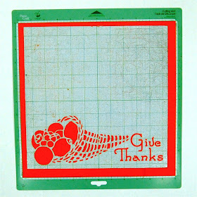
Give Thanks Page Background


I like to keep scrapbooking simple.  When I look at the very elaborate pages with layers and layers of embellishments I have trouble finding the photos.  I like the page to support the photos but to stay part of the background so the story and the photos are the most important things on the page.


When I make cards, I often create a design that cuts an image into the card front.  I decided to start making some page backgrounds using the same technique.  I bought this book of Floral Stencil Designs from the new Dover Pictura site.  It has lots of great images that are simple to trace with the Silhouette Studio software and turn into cutting files (other programs that allow you to trace a shape will also work).


After I created the file I cut the page, using a double cut to be sure that all of the fine details would cut cleanly.  As you can see - it cut perfectly (yes, I do use my Cricut mats in my Cameo sometimes - I have lots of them and they work just fine).


I set the file up to cut the page at 11 x 11 inches to allow for a background paper to make a border.  I adhered some brown paper behind the cut and then experimented with various papers for the outer border.


This is a very dark green textured cardstock...a bit too dull...


This medium green has more life - but it is also a solid.  I decided to try some patterned papers.


I bought this stack on clearance last year.  It is a Halloween stack but the are some pages that are just overall patterns with no bats or pumpkins.


I liked this subtle yellow herringbone page - it is hard to see in a photo but the texture is obvious when you look at the page so it doesn't seem as solid as it looks here.

 
This plaid gives it some real zing! 

I think these pages will make quick and easy projects.  The paper choices can give very different looks.  You could try a small patterned paper behind the cutouts or just use two layers instead of backing the openings with a third color or pattern.

I am excited to try cutting more of these designs.  I have quite a few already set up on the computer but i won't have a chance to cut any more or add photos to this page until next week. 

What do you think of this type of page?  Are you a "flat scrapper" like me or do you prefer lots of lumps and bumps on your pages?

We are off on a short trip this weekend - I'll tell you all about it when we return.  I plan to have posts set up to publish while we are gone but if something doesn't work out it's only for a few days.  Have a great week!

Subscribe to Capadia Designs if you would like to have new posts delivered directly to your email. Share/Bookmark

Tuesday, September 18, 2012

Happy Monster Shaped Card for Halloween


There is definitely a nip of fall in the air and Halloween will be here before we know it.  Yesterday I started testing some new project files.  I have been using digital content that I have purchased over the years to create print and cut as well as regular cut files.  I have been doing digital scrapbooking for years and I have lots of papers and elements from Creative Memories and many other sources.


Creative Memories now sells digital content in a universal format (jpegs and pngs) in addition to the self installing sets that work with directly with the StoryBook Creator 4.0 program.  You can purchase these downloads and use them for digital scrapbooking in any program or adapt them for print and cut projects.  I chose this set of Classic Halloween Digital Embellishments.  I liked the little green monster shaped candy bag in the top left corner.

One of the things I like the most about using the Silhouette machines is the freedom I have to use my own images for print and cut projects.  I'll explain the step by step process in another post.  It is pretty simple to import an image into the Silhouette software and then trace it to create cutting lines.


I traced the monster (I called him Frank) and then created a shaped card.  The back of the card is blank but you could print both sides.  I was trying to conserve printer ink.  I don't have a 12 x 12 printer (but I hope to someday soon...) so I had to set the card up to print on 8 1/2 x 11 cardstock.  I filled in a few small monster images to use on another project along the side.


The cut was nearly perfect - I moved things around on my mat and I didn't quite get it back into perfect alignment when I set up the print and cut.


 I simply inked all around the front of the card with some "Mowed Lawn" seasonal Distress Ink - this hid any white lines and gave a nice bit of shading to the card.  (Distress Inks and reinkers are on sale this week at Blitsy).


I used some Black Diamond Stickles glitter glue to highlight the monster's hair, mouth and added small centers to the eyes.


 It's a bit hard to see the Stickles - here is another view.


I stamped the inside with a Studio G dollar stamp set (I collected these for a few years and stopped when I realized that I hardly ever used them.  I keep them in a binder and "rediscovered" them while sorting out my craft room).


I had to take one more photo with my spiky flower frog holding the card.  The monster seems to be immune to the pain of the spikes!

Have you started making Halloween projects?  I am planning to actually send some of the cards I make this year...

Subscribe to Capadia Designs if you would like to have new posts delivered directly to your email. Share/Bookmark