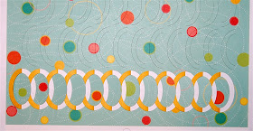
I have been trying all sorts of variations with the incire patterns and I decided to try a full page background for a layout. The paper I chose is yellow on one side and has an interesting dotted pattern on the other side.
In this close up shot you can see how the design looked after cutting. I alternated the directions of the rows of cuts to add more interest.
Once the design is cut, the first step is to lift each half loop and fold it over.
Then you simply tuck each loop under the oval next to it, all the way along the row.
Here are the first two rows after folding and tucking.
You could choose to cut only a few rows and leave part of the background plain.
I liked the idea of filling the page to add a lot of texture.
Just keep folding and tucking, one row at a time. I think it is easier to fold all of the loops and then tuck them all at that same time.
If you want to layer the finished page over another color you can get a very complicated look that is actually quite easy to make. The end loops should be fastened down with a bit of adhesive (I haven't done that yet).
Now I just have to look around for some photos to use on this page (maybe I should have started with the photos and then chosen the paper!).
What do you think? Do you like the look or is it too busy? I don't think any of these photos show the texture very well - I'll take some more shots when I finish the page...
Subscribe to Capadia Designs


Looks like alot of work but well worth it. I like that you can change it up by changing the back paper. Very cool!
ReplyDeleteWow I love it. Hope you show the completed page.
ReplyDeleteJeannie
Wow, I love this! I can't wait to see the finished page! Definitely not too fussy, IMHO.
ReplyDeleteYour right it does look very complicated but I can see how it could be easier than it looks. Depending on the picture, it might be really nice for just an accent row. I like it, thanks for sharing!
ReplyDeleteLove it! Definitely too fussy... Silhouette makes it easy. Not to busy when you factor photos covering some of that page (which is almost a shame!). Personally, I'd back it with red to tie in with the spots on the paper and make it a page about a child, but that's just me. I can't wait to see what you do with it!!!
ReplyDeleteSaw this before, someone had a die that does this type of cutting. Very interesting and I would like to know more about it. Was this done with a die or the computer? Please do a video on this very interesting design. TFS...
ReplyDeleteDianne Bell - Sewpro02@aol.com
I love it! Will I be able to do this with DS?
ReplyDeleteBeautiful. I think it would be a shame to cover it with photos, but that is that's often done with scrap booking. I needed some new ideas for my scrap book project and this will fit the bill.
ReplyDeleteI will just design it in make the cut software, and depending on the paper I choose, I will cut it on either the zing or the cameo.
This is such an interesting look> I have a couple of dies that will do this, but I am limited to only the one size, and the fact that I only have the cricut. I'm seeing an additional machine in my future....TFS
ReplyDeleteSHELLEE
Diane, this is so kewl, but I definitely need a video on this one.
ReplyDeleteDiane, I really love the cuts you have been designing and making. I am very interested in doing the same and because of your posts I am thinking I will get the Cameo. Will they ever go on sale?
ReplyDeleteI am very new to paper crafting but I had found these photos of similar cuts a while back and thought I would share them with you. I think these are really cool.
http://www.flickr.com/photos/yoshinobu_miyamoto/sets/
I love the geometry and want to try doing several like these. I have no idea what I would use them for but I just love them.
This is very cool!! I really like the look! Please do show the completed page!!
ReplyDeleteLove how the effect turned out on a full page, Diane. So cool. TFS ;- )
ReplyDeleteLooks like a work of art that could be framed & hung on the wall! It would be a shame to do all that work just to cover it up with photos.
ReplyDeleteHi Diane,
ReplyDeleteI've always wanted to do this, but didn't want to buy the expensive dies. I'm a bit late this particular party, so did you design these? Or are they on the Silhouette Design pages to buy?
Thanks
Leslie Ann
Very interesting. I am amazed at what you are able to design with the various machines. Since you asked for an opinion, I will give you mine. I think the cut'n tuck design with the patterned paper is too busy. I have done incire the old way, with the brass stencil and craft knife. I find it very effective with all solid colors or with one of the papers with a tiny or subtle print. I also think it is nicer with one row as an accent or perhaps with 4 rows arranged as a frame for a photo. But then, I tend to prefer simple designs and some open space. I am eager to see what else you will do with it.
ReplyDelete