Pages

Sunday, July 31, 2011

A Digital Page or two...


Earlier this month, I took some photos of my little neighbors in our back yard.  They were running down the hill and smelling the flowers and generally having a lot of fun.  It is difficult to capture good photos of small children in action, but I had my camera with me and so I gave it a try!


This was one of the photos I took - she has a cute expression but there is a day lily stem on top of her head and the lighting is not very well balanced.  Thank goodness for digital photography and photo editing software!


 I use the Creative Memories Memory Manager 3.0 program to do most of my photo editing and the StoryBook Creator Plus 3.0 program for my digital pages.  Both of these programs are relatively inexpensive and easy to use but they are capable of producing fairly sophisticated results.  As you can see above, I was able to crop and fix the lighting and other problems to produce a very sweet image (of course - she is adorable so that helps!).


Once I completed my editing and corrections in Memory Manager, I brought the photo into the StoryBook Creator program and applied various effects.  The one I like the most was this "oil painting" effect.  It is amazing what a few clicks of the mouse can produce!


I made the photo as large as possible and layered it on some summery background paper.   One simple word is all it takes to title this page.  I think it would be great on a calendar.


While I was at it, I decided to try a few more pages.  This one started off as a pre-designed page but I eliminated some of the elements and rotated others to get this result.  The items I used are from the Cottage Garden digital collection.  The swirls and butterflies add a feeling of motion that remind me of the children running up and down our small hill.


Here is another page with the same phrase but different papers and another photo that was taken at nearly the same time.  These are papers from the Reminisce spring digital addition.  Both pages have just one photo and the same sentiment but the style is definitely different.


An easy way to work on a layout is to start with a predesigned page from one of the books.  You can then click and fill the various shapes and "tweak" the page to suit your photo and story.  You can also use these digital page designs as inspiration for your paper pages.


This is the page I made using the book blank page as a resource.  The colors are more subdued so the photos really pop out.  I particularly liked this quote.

I hope you are having a nice weekend.  We'll be doing more painting today - we are on the fourth (!) color choice for our bedroom walls - I hope this one works out...  I also need to clear away all of the kitchen counters before the floor sanders come - now that's a job!

Subscribe to Capadia Designs 

  Share/Bookmark

Saturday, July 30, 2011

A Handy Adhesive for Intricate DieCuts


Today I have a quick tip for you about a product that I tried recently.  One of the things I noticed at CHA was the number of types of adhesives that are available for crafters.  In most of the workshops, manufacturers had donated adhesive to use for the project so I had a chance to try some that were new to me.  Sometimes you need a wet adhesive and sometimes a dry adhesive will work better for your project.  I like to cut very intricate designs and I usually use a glue pen to adhere these to my card or page.


Letraset recently sent me this sample pack of their product called "LetraTac" - you can read all of the details about this product on their website HERE and on their blog HERE.  This is a sheet of very thin adhesive dots that are great for the intricate cuts.


I was helping a friend with the finishing touches on a scrapbook and she wanted to add some Kanji characters to a page that highlighted "Japan Day" at her son's school.  We looked up some of the words that seemed appropriate on the Pagoda Cricut cartridge.  The words we chose were "love, health, prosperity and happiness" (from left to right above).  After the letters were cut out (at 1 1/2 inches) we placed them on the adhesive.


Then we put back the protective covering sheet and used this tool to burnish the letters and pick up the adhesive.


Next, we lifted the letters from the adhesive sheet.  As you can see, many small white dots of adhesive were transferred to the characters.


 The adhesive is repositionable so we had time to decide on just the right position for the words and make some slight adjustments.  Once they were settled in place, we burnished them to the page.  The adhesive becomes permanent over time.


Since the Kanji characters are very irregular in shape there is more adhesive in this area that I can use for my next intricate cut.  It is easy to see if the adhesive is added to your cut because it is white and shows up well on most paper and cardstock.

LetraTac is available in the US online at Dick Blick  HERE, at Art Supply Warehouse HERE, DaVinci Artist Supply HERE, and may be available in your local craft or art supply store.

You can see a different (and very creative) way to use the LetraTac HERE - just add some Pearl Ex for a really interesting effect!

Lettering Delights Clearance Sale


Free Product


I want to remind you that there are just a couple of days left to shop for the Lettering Delights graphics, alphabets, paper packs and fonts that will be retiring.  At 50 cents each these are a great deal.  There are also some super bundles and an additional special offer of $25 off if your order totals $60 or more.  The code for the $25 savings is "SparkleSavings" (this offer does not apply to the Simple Shapes Super Bundle which is already heavily discounted).

Just click the affiliate link above or in the left side column to go to the site and shop the sale.  I use some of the Lettering Delights sets in my digital scrapbooking and they also offer SVGs that can be used with many die cutting machines and programs.  The Clearance Sale and the special $25 off offer both expire at midnight Mountain Time on Sunday, July 31st.

One more note,  if you want an easy way to see the meaning of each of the Kanji characters on the Pagoda cartridge, please visit the post HERE where I reviewed the cartridge.  This post includes a chart I prepared with the translations on a keypad overlay and you can download this for personal use.

I hope you have a wonderful weekend - there will be a lot of painting going on around here.  Our construction is nearly finished (the wood floors get sanded and refinished next week) and we'd love to get all of the furniture back to where it belongs as soon as we can!

Subscribe to Capadia Designs 

  Share/Bookmark

Friday, July 29, 2011

Cartridge Update for July


Yesterday was "Hello Thursday" and five new Cricut cartridges were announced.  The new cartridges are:

Art Philosophy (a Close to My Heart - CTMH exclusive)


and

Sophie (exclusive for Cricut Circle Members)


There is a new web announcement page (HERE) with cute graphics for Hello Thursday.  You can click on the cartridges on the shelves to reveal the "Look Book,"  projects and other information for each cartridge.

There are more projects on the Official Cricut Blog HERE and on the Hello Thursday blogs - here are some links for you

Melanie's Blog
(Melanie is a CTMH consultant and you can order the Art Philosophy cartridge bundle - with 3 sets of stamps and chipboard - through her if you don't have a consultant)
Mixology Blog

There was not an update for Design Studio when I checked late last night.  There is a Gypsy update - just connect your Gypsy to the computer and run Cricut Sync.  My update took about an hour.

Art Philosophy, Art Nouveau and Sophie are the type of cartridge that I prefer. The Art Nouveau cartridge has some items in a completely new style for Cricut.  Sophie and Art Philosphy are more similar to existing cartridges.  The Scarecrow and Something to Celebrate cartridges are not really my style - I just don't see a need for that many scarecrows and I really don't care for food with faces!  This is just my first reaction - I haven't had much time to look over the cartridge contents.

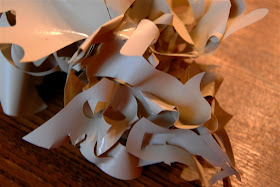
I have accumulated so many cartridges that I really need to LOVE a cartridge to want to add it to my collection.  I am also designing more and more of my own items using the Silhouette Studio software or a few other programs that give me a lot of creative freedom.  The image at the top of this post is a snippet of one of my designs.  I cut it with the Silhouette and I am very impressed with the clean and accurate cuts.

Have a great weekend - the summer is flying by and next week it will be August!

Subscribe to Capadia Designs

Share/Bookmark

Thursday, July 28, 2011

La Blanche Stamps at CHA


Today I have another photo intensive post to share.  One of my favorite discoveries at the Winter CHA in Los Angeles was the La Blanche stamps.  If you missed my first post about this company you can find it HERE and you can visit their website HERE.  These incredibly detailed and elegant stamps have a style that appeals to many people and are becoming very popular.


Crowds would gather around the booth when Jacqueline was demonstrating her technique for coloring and embossing the images.  She often uses a lot of UTEE (ultra thick embossing enamel) to finish a piece with a hard glossy coating.


There are more step by step photos in the post I linked above.  She uses distress inks and pen nibs to color the images.


The booth was full of incredible examples of art made with these images.  There were lots of fabric flowers and laces added to collages that have a very "old world" style with a twist.


You can click on any of these photos to enlarge the image and see the details more clearly.  Believe it or not, there were even more samples on display - all of them were simply amazing!


I hope you enjoyed this "virtual visit" to the La Blanche booth.  Even if this is not your typical style it is easy to appreciate the talent it took to create these beautiful samples.


While at CHA, I had a chance to meet up with Joan who is an internet friend.  We have emailed back and forth when she needed some help with Design Studio.  Joan is a big fan of the LaBlanche line and sells them in her online store.


Joan was lucky enough to receive this lovely piece as a gift.  You can read about her meeting with Jacqueline HERE and also see the stamps that she will have available for sale soon.

Just a quick reminder - the Creative Memories "FANtastic" sale celebrating their Best Brand win will end tonight (Thursday) at 11:59 p.m. (Central Time).  The discounts are up to 40% with over 150 items on sale.  You can shop on my CM personal website HERE if you do not already have a consultant.  Please don't hesitate to contact me with any questions.

Subscribe to Capadia Designs

Share/Bookmark

Wednesday, July 27, 2011

Room Names at Albany House


While I was staying with my sister and brother-in-law, I did a few little projects around the Bed & Breakfast. One of the hard things about running this type of business is that you need to keep very busy during the busy seasons so you will have enough income to tide you over the slow times.  If you are busy with the day to day cooking and cleaning, it is hard to find time for "extra" projects.  One of the projects that I was able to help with was to identify the guest rooms so it would be easier for the guests to be sure they were in the right room when they first go upstairs.


Before I left on my trip I did some work with my Gypsy and Design Studio.  I wanted to weld the letters of the room names so that they would be easier to apply to the doors.  My first trial was done with the Gypsy Font cartridge (only available in the Gypsy).  I thought it looked OK but the "feel" of the letters was not quite in keeping with the style of the B & B.


 Next I tried this font from the Songbird cartridge.  This one looked like a keeper so I set  up a file to cut the vinyl.  I made the words 2 1/2 inches tall.


I had sheets of 12 x 24 vinyl and I decided to do each name twice so I would have a backup in case something went wrong when the names were applied to the doors.  The extra exclamation points were for the apostrophe in "Eagle's Nest" and the extra "l"s were for another project.

To cut the vinyl I used the regular blade set at 3 with medium speed and pressure.  This makes a "kiss cut" so the letter is cut out but the backing sheet stays intact.  The vinyl cuts very cleanly and I was able to put the words quite close together with no problems in  cutting.


I brought the cut vinyl (still on the backing sheet) and some transfer tape with me on the trip to Wisconsin.


After CHA, I had some time to work on applying the names to the doors.  I cut apart all of the words and "weeded" the sections (weeding is the process of removing all of the unnecessary pieces of vinyl from the backing sheet).  The "hook" tool in the Cricut tool kit works very well to do this.


I always feel like I should save the scraps but the Cricut Vinyl is very thin and sticky and it is too difficult to keep the pieces from adhering to each other.  I want a clean and easy word application so I sacrificed the excess vinyl.


I applied the transfer tape to the weeded words...


...and then gently peeled back the word from the original vinyl backing sheet. To keep everything in order, I put the tape with the vinyl back on the transfer tape backing sheet until it was time to add the names to the doors.


 I simply lifted the words on the transfer tape and centered the words on each door.  Then I burnished the vinyl area and made sure that the names were securely attached.


The rooms with the short names were simple to do.


For the two word names I took extra care to line up the words.  You could use painter's tape to set a straight line but it is fairly easy to "eyeball" the placement.


Vinyl is fun to work with and it cuts very easily and neatly.  You do have to be careful to keep the packages up and away from small hands.


With a very small investment in materials and a slightly larger investment of time,  I was able to create these identifiers for each of the guest rooms.

 Today was a "re-entry day" for me - there is always so much to do and to catch up with after a long trip.  I have moved all of the crafty items to my studio and now need to put them away and to photograph some more of the workshop projects.


 A few people let me know that a photo of me and my friend Joe was on the DCWV blog.  We were in the Halloween Advent Calendar workshop and when this photo was taken we were working on the little pockets that hang from the embroidery hoop frame and hold either a trick or a treat.  Since I am always behind the camera it was nice to see this "action shot" of myself from the show.  The class was a lot of fun and I will assemble my calendar and show you how it turned out a bit later this fall.


Subscribe to Capadia Designs 

  Share/Bookmark