Thanks to everyone who followed the Creative Charms blog hop and the Disney Pixar blog hop. Some of you are new to my blog. I hope you will enjoy what you find here and that you will continue to visit and join in with some of our discussions.
The Grand Prize for the Creative Charms hop will be posted today on the Creative Charms blog. I will draw the winners for the small items on my blog for both hops and post the names later today. I should also have some information about the new Creative Charms Kit and Deal of the Month to share later today as well.
The Grand Prize Winner (of a new Gypsy!) for the Disney Pixar blog hop will be announced on Wednesday.
I wanted to show you the original photo of the tulip that was at the top of my post a few days ago. This is straight from the camera and there is a lot of distraction in the background.
Here is the photo after cropping to a square, adjusting the color and light and removing some of the twigs. It usually looks better to have the main image off center a bit. This photo still has some leaves at the bottom that are light in color.
I used the cloning tool to remove any of the items in the background that take attention away from the lovely tulip. This photo could be used on a card front with a quote or greeting in the dark area. I wanted to try some more experiments with this image.
I dropped out the background to save just the tulip image.
Then I played around with some filters to add effects. Here I "posterized" the image and added some wrinkles digitally.
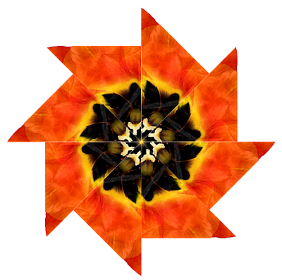
I cut out a triangular section and then repeated it to create a new shape with a kaleidoscope effect.

This is easy to do as long as you pay attention to the amount of rotation and align the images carefully.
Next, I trimmed the image to an octagon shape. I combined these in rows of six at two inches to fill a 12 x 12 page.
I also added a background square and experimented with the color combinations.
The possibilities are truly endless - and if I don't like what I see I can simply "undo" (this is one of the biggest benefits of digital work for me).
The various background colors give many different looks - the amount of contrast is the most important factor to make the colors blend or stand out.
By altering the hue I can create a totally new design. It is hard to believe that this new page started from a single orange tulip.
I did all of this editing and manipulation with the Creative Memories Memory Manager 3.0 and StoryBook Creator Plus 3.0. Both of these programs are easy to use. If you would like to know more about the software and you don't have a local consultant that you work with, I would be happy to help you.
Please check back later today for the winners - and let me know if you have any questions. For those of you who are new, you can click below or near the top of the right column to subscribe to my blog so you will receive updates via email when I post something new (once a day).
link to discussion Day #3 - Time to CraftSubscribe to Capadia Designs


OMG!! how awesome!!!! LOVE how you detail it all out - THANKS!!!
ReplyDeleteparkernana5@cox.net
I have to say, I thought my photography was good but yours is so nice and clear. What kind of camera do you use?
ReplyDeleteMichelle
AWSOME! I loved the original photo and I the paper you created as well. Thanks for sharing the "how to" as well. I have some photos that I want to work with. I have been taking "flora" photographs for awhile but needed something new to do with them.
ReplyDeletesyoung6987 at aol dot com
Loved this & hope you will do some more posts like it.
ReplyDeleteThis is just awesome!! I cannot think of a better word! You are amazing! Thanks for sharing your talent!!
ReplyDeleteI love your flower pics...the originals as well as the 'altered' ones. You are so creative...thanks for sharing w the rest of us!
ReplyDeleteCarol aka cyimbugbitten
bugbitten at hotmail dot com
You have created some amazing digital effects. My favorite might be the kaleidoscope effect...stunning. The octagon shapes remind me of a patchwork quilt. Great job!!!
ReplyDeleteKathryn
Wow!
ReplyDeleteOh My Gosh Diane!! You are amazing with what you can do with one photo! Thanks for sharing this amazing Work of Art!!
ReplyDeleteRexann♥
Love it! Say it again, you are awesome!
ReplyDeleteMarilyn
Love, love, love what you can do!
ReplyDeleteI love how you did that! So many options and colors! Wonderful!
ReplyDeleteHi Diane: Just wanted to wish you Happy Spring and let you know how lovely this post is. I know you are a quilting afficionado and this would be a lovely quilt. As always, thanks for the great posts and blog. Keep up the good work. Your SF friend, Pam F.
ReplyDeleteYou techiques are absolutely AMAZING! TFS!
ReplyDelete