Pages
▼
Thursday, March 31, 2011
Time for Tea - Imagine that!
There as been a lot of activity in the craftroom but right now it looks even worse than it did before I started. Sometimes you need to make a big mess to get everything sorted out! I have moved some things around to make room for the IKEA items - it's going to be awesome!
I moved the Imagine table and couldn't resist taking a few minutes to try out the cartridge I just bought - Imagine More Cards. I also found this American Crafts White textured cardstock at Marshall's (good finds there lately!).
There are 60 sheets in a package and the best part was the price...
...which meant is was less than 12 cents a sheet.
I printed out the first four papers in the handbook at full 12 x 12 size. It is fun to be able to do this - and as long as you have a supply of white paper and your ink cartridges are full, you can produce the exact shade of paper that you need or choose from all of the patterns on the cartridges that you own.
The patterns look great on the textured paper. I also found some kraft cardstock that I've been wanting to use so I decided to make a quick card. It is so easy to get sidetracked when you are supposed to be doing a bigger project!
I chose this image on the Imagine More cards cartridge and selected the layers option. Then I deleted everything but the cup and saucer image and printed and cut just that image.
I had already printed this piece of paper and I trimmed the bottom to have just the red check and yellow dots stripes showing.
I cut a section to 5 1/2 inches and layered it on the front of my card. One thing that I don't always like is the "distressing" on most of the papers for the Imagine. I made sure to trim my stripes from the center to avoid the dark distressed area at the edge.
The "Time for Tea" stamp is from Taylored Expressions, part of the CreativiTEA set (you can see it HERE). I stamped it twice in two shades of blue offset a bit for a shadow effect.
I used some foam squares to lift up the cup and saucer. I can't remember which brand these are but they are not easy to work with. I should just toss them but I don't like to waste things so, on days when I feel a bit patient, I try them. Soon they will be gone!
I wanted a simple card but this just looked too plain. Fortunately, it just needed a quick and inexpensive addition to finish it off.
I pulled out my white pen and added some stitching. First I did the sides, thinking that I might add a bow on the top but I decided that it would be better to just finish the stitching all the way around the top.
The stitching along the top frames the image nicely. I use a Uni-ball Signo UM-153 white pen and it is the best I have found. You can get them from JetPens for $2.25 each or $21.50 for a box of 10 and if you add one or two other items so your total is $25 or more, the shipping is free. You'll probably want to get the box so you won't run out and the pens also make great little gifts for your crafting friends. Here is a LINK (I am not affiliated with this company - I just love these pens and this is the best place I have found to buy them!).
It is amazing what a few little lines can do. In this close view you can also see how closely the Imagine cut around the cup and saucer. This was just a smaller part of a composite image but when you separate it and enlarge it I think it is a great focal point for a card.
Kraft cardstock is by nature uneven and tough but I did not like this dark area on the inside of my card (I should have looked inside first before completing the front!). I borrowed a trick from my friend Joy (Obsessed with Scrapbooking)...
...and added a thin strip (the edge I cut from the paper on the front) to the inside of the card - problem solved!
Now it's back to work in the craft room while I keep an eye out for the predicted snow - an April Fools Day storm could be coming our way.
If you are a Facebook user, you might want to go "like" the Creative Memories Home Office page. They say that there will be an awesome surprise for US and Canadian customers and consultants to be revealed on Friday - April 1st. It is supposed to be something that will make everyone HAPPY! I have no idea what it is but it sounds like it could be really good!
Subscribe to Capadia Designs
Wednesday, March 30, 2011
Reminders and new projects...
I had a very successful trip to IKEA - so now I have some assembling to do! I just want to give you a few reminders today as we reach the end of the month. Believe it or not there is talk here of a major storm for April first - and it could be snow! It was sunny but chilly today. I can't wait for spring to really begin.
I always enjoy working with these embellishments when I do my Design Team projects. I just used a few Creative Charms jewels and a flower yesterday on the pink purse.
The sale on the Creative Memories StoryBook Creator Plus 3.0 download ends on the 31st as well. You can save $20 on the program and start creating cards and layouts that combine digital and diecutting. Here is a LINK to the page on my CM Website for the PC version. You can find the Mac version HERE.
You can do many types of projects with the digital programs - not all of them will be scrapbook pages. I used the StoryBook program to create this diagram to help teach how to line an envelope.
Last Spring I used the StoryBook program with some of the Creative Memories digital content and some items from Lettering Delights to create this digital layout. Patriot's Day will be here again in just a few weeks!
The Lettering Delights Dollar Days sale is also continuing - this only happens twice a year and it is a great time to buy some of the items from your wishlist. Just click the affiliate link above or in the side column to go to the Lettering Delights site. I know I will be making another order in the next day or two.
I have received my copy of the Stork's Delivery cartridge and just started to do a few projects with it. If you are interested in this cartridge you can see more about it at THIS PAGE on my CM website. I'll be doing a full review of the cartridge within the coming week.
I can't wait to show you what will soon be my new and improved crafting space. I want to do some painting but that will have to wait for true Spring weather and temperatures. I have lots of sorting left to do...
Have a Happy Wednesday!
Subscribe to Capadia Designs
Tuesday, March 29, 2011
Pretty Pink Purse (and a few tips)
I recently stumbled across some lovely faux leather paper in pearlized colors from American Crafts (in Marshall's of all places!). I wanted to give it a try and I thought it was perfect for making a paper purse to use as a table favor or gift holder.
I have been trying to use some of the cartridges that I purchased in the Black Friday sales last year, you know - the ones I "had to have" that have been sitting idly on the shelf. One of these was "Forever Young" which is an older cartridge I didn't get at first because didn't think I needed such a "girly" cartridge.
I decided to make one of the purses and today I'd like to share a few tips I have for cutting and putting together bags and boxes from your Cricut cartridges.
I knew that my paper was only 8/12 x 11 so I used Design Studio to figure out the largest bag I could cut. I placed a rectangle on the second page of the file and adjusted it to be 8 1/2 x 11 and then I added the purse to the mat and sized it to fit with a little room to spare. I set the paper at the 1/2 inch mark from both the top and the side to avoid any issues with the "uncuttable" area of the mat. I used the preview to see exactly where to place the purse on the mat.
One of my pet peeves with the cartridges is the "tick marks" they cut to indicate the folds. For a regular card they are nonsensical - we all know how to fold a piece of paper in half!
On the boxes and purses they make a very untidy edge that is not attractive. You can see the edges in the sample purse I cut from scrap paper above.
I don't like my pretty papers to be messed up with all of these extra lines. So I use Design Studio or the Gypsy to eliminate all of the interior cuts (known as webbing) with one simple step - just check the weld box.
In the case of the purses on Forever Young you will also need to use "hide contour" to eliminate the word that is designed to cut into the front.
The "webbing" lines will not cut when weld is checked because they are not completed cuts. The word "fancy" in this case is one continuous line and would cut if it was not hidden, similar to the way the eyes on one of the animal faces will cut even though you lose some of the detail lines when you weld to make a shaped card (I do have a way to work around that problem which you can read about HERE and HERE).
I then use my sample cut with the marks to help me see where to score the purse to fold it correctly. These score lines will be clean and neat with no cuts.
To assemble purses and boxes, I use a strong tape like Scor-Tape. The red liner tape also works very well for boxes. First you connect the flap to the side.
Line it up carefully for a neat edge like this. Remember, these adhesives are very aggressive so it is important to get it right the first time!
Next you fold in the flaps to make the bottom of the bag. First fold in the long side with the "U" shaped cut-out.
Next, fold in the two side flaps and be sure the bumps catch underneath the first side.
Finally, tuck in the last long side so it looks like this.
I was concerned that the bottom of the purse might not be sturdy enough for some heavy candy to be added so I cut an extra piece of cardstock to add as a reinforcement on the base.
I used Scor-Tape again to attach this piece to the base of the purse.
I also cut a strip of paper at 1/2 inch x 10 inches to use for a handle or strap. I added about an inch long piece of Scor-Tape to each end.
Then I secured the handle inside the bag to get a strong hold.
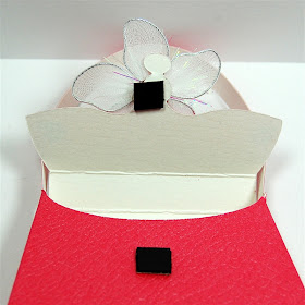
The cartridge design has tab and slit closure and these can wear out quickly. So I added some small magnet pieces to close the flap. These were cut from some leftover magnet frame material I had at home.
I matched up the two small pieces making sure that the polarity was correct so the magnet would work and then used Scor-Tape once again to secure the magnet to the purse.
First I attached the two pieces together to the top flap and then I removed the protective covering on the Scor-Tape and folded the flap down to stick the second magnet in the correct position.
You can buy "prettier" round punched magnets but these worked fine (and I had the frame on hand).
The decorations for the bag are these vintage jewels and a white flared flower from Creative Charms. They give a nice sheen and sparkle to the bag.
I hope you picked up a few tips for making very neat and professional looking bags and boxes. I think I'll try making a few of the other purses on the Forever Young cartridge and use them for gifts - or just sit them on a shelf to look pretty!
I am off today on another excursion to IKEA - and hoping the items I want are still there!
Subscribe to Capadia Designs
Monday, March 28, 2011
Lace Cardstock with Martha Stewart Borders.
Today is Monday so you'll find another installment of "Martha on Monday" over on the Scrappy-Go-Lucky blog. This week I demonstrated how to create your own lace cardstock by welding together several borders. I have used this technique for many mesh pages. The Martha Stewart cartridges have lots of lovely borders and there are many other cartridges that will also work (Storybook is one of my favorites for doing this).
There is a step by step explanation and lots of photos showing how to create the flower mesh you can see above on the Scrappy-Go-Lucky blog at THIS POST.
This leafy mesh is another example of a design created from borders. This one is much more delicate than the flower mesh.
Here is the border from the Martha Stewart Seasonal Cake Art cartridge that I used for this mesh.
You want to be sure to use a sticky mat - not a brand new one but one that is "just right" to keep the paper firmly stuck during the cut. It takes quite a while to cut out something this intricate. Above you can see the delicate cuts in the paper still on the mat. You want a sturdy paper, not thin text weight but not too thick. If you use heavy cardstock you might not get a clean cut - I would recommend trying a multi-cut if you want to use heavier weight material.
When the cut is finished, you can remove the outer edge around the design.
You could save this piece and use it as a frame on another page.
Take your time as you lift the cut from the mat. The stems are extremely delicate.
I only had one place where a leaf came apart - I was distracted by something and tugged a bit too hard when I was lifting that section. It is simple to glue it down so the break won't show.
Changing the background paper gives an entirely different look.
If you'd like to try cutting this mesh you can download my file HERE. The file for the flower lace is available on the Scrappy-Go-Lucky blog. You'll find all sorts of inspiration if you check out the projects my fellow Design Team members have been making so be sure to scroll back through the posts.
Thanks for all of the advice on the paint color for the garage. I am planning to show you more simple style scrapbook pages soon now that I know that many of you enjoy this type of page as a supplement or alternative to the very heavily embellished and layered pages that are so popular right now. I hope you have a wonderful Monday.
Subscribe to Capadia Designs