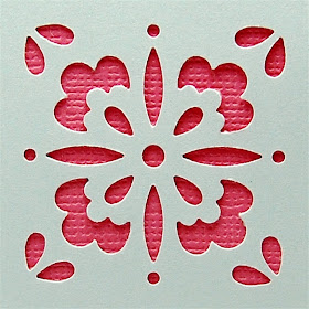
I added another Martha Stewart "Punch All Over the Page" punch to my collection recently. If you missed my first review of these punches, you can find it HERE.
These cards were made with the "studded heart" set that I reviewed last October. As I mentioned in that review - if you have a Cricut, you can make cuts anywhere on your project so this type of punch is not really needed (unless you also like to collect punches). I did find this particular design useful because it has such tiny holes around the heart and those would be very difficult to cut with the Cricut.
The set I recently purchased is called "floral tile" and I chose it because it also had some tiny circle cuts. I also thought it would be fun to try making some lace cardstock with this punch. I am working on a system to make punching even patterns with these punches simpler and more accurate.
The punch works with magnets and the notched corner, along with the polarity of the magnets, makes it easy for you to line it up correctly.
I centered the punch on a plain white cardstock A2 card (the photo is grayed to help you see the design better). It is so simple and pretty with just the one punch. Of course you can add more punches in a planned design for a fancier card.
You could make a set of cards with different colors of cardstock centered on the inside of the card to add just a tiny splash of color.
I think the stripe of color is a bit more interesting than a full liner would be.
You could easily make up a lot of these cards and then just add a stamped sentiment to suit the occasions when you need a quick card. Sometimes simple is the way to go!
We are watching the weather carefully and hoping that there will not be any snow to delay our flight - fingers crossed!
Subscribe to Capadia Designs I think the stripe of color is a bit more interesting than a full liner would be.
You could easily make up a lot of these cards and then just add a stamped sentiment to suit the occasions when you need a quick card. Sometimes simple is the way to go!
We are watching the weather carefully and hoping that there will not be any snow to delay our flight - fingers crossed!


Diane- This was the first one of these punches I bought because it is so pretty. If you made several of these they would make a great gift. Simple notecards and maybe a matching envelope. Thanks for sharing.
ReplyDeleteI've never seen these punches before, but now I need to find them. I am all about simplicity and this is simplicity at its best.
ReplyDeleteJazzy
www.jazzyscards.blogspot.com
first off, have a great time on your cruise, and don't let your 'evil twin' lead you astray ;-). next, are there instructions on how to line up the punch accurately to have 3 windows in a frame. example shown on the pkg the punch came in. i'd like to get the square punch to create windows w/o having to fire up ds and the cricut.
ReplyDeletekat
Diane I love the simplicity as well as the elegance of this card! And oh the possibilities with the color changes too! You're right it would be an awesome gift to make some in different colors! Thanks for sharing your creative thoughts!
ReplyDeleteKris in Alaska
funamom at yahoo dot com
Simple can be very elegant.
ReplyDeleteWhat a cool idea! I love using negative space in my projects.
ReplyDeleteI love the lookof these punches. Our local HL only caries a few od the simplest ones. We are getting a Joann's and I hope they have more of a selection. Otherwise I will have to shop online.
ReplyDeleteGorgeous! I love your card!
ReplyDeleteVery elegant and simple card! Once again, a great idea from your great mind!
ReplyDeleteShellee