Pages
▼
Monday, May 31, 2010
A Surprise in the Garden...
I hope you had a lovely long weekend. Our weather here in New England was beautiful, sunny and warm but not too humid. Perfect for gardening, parades and cookouts. Thanks to my husband (the gardener) our yard is looking very nice. I am taking lots of photos as different plants start blooming.
I hope you are not tired of iris - this pink iris appeared most unexpectedly near the pink rhododendron bushes. We figured out that it was one that was transplanted last year but did not bloom until this year.
I find it very relaxing to experiment with all of the digital effects I can apply to my photos. Here I used a "posterize" filter to alter the flower image. This effect is one of my favorites. I use the Creative Memories StoryBook Creator Plus 3.0 software for my digital experiments. I can create images like this to use for card fronts, adding sentiments to suit the occasion.
I made a .png file of the pink iris to share with those of you who do digital scrapping. If you do download the image and use it, I would love to see what you make.
Pink Iris
I have been busy reorganizing our home computer workspaces - the Mac has moved to the kitchen which is very handy. I've also been working on learning some new software - more about that soon... The Gypsy updates have inspired me to to start using my Gypsy again so I will have more files to share soon - I have already designed quite a few but need to test cut them this week.
Subscribe to Capadia Designs
Sunday, May 30, 2010
Variation on the Gypsy Star Card
Thanks to everyone who volunteered to test the file for the card I posted yesterday. I actually took a bit of a break today and did not have a chance to send the file out - but I did retest it and it is ready to share. I left the first page in the file - that page shows the element I used and has my original design which I resized to fit an A2 card.
I don't think I explained yesterday that the star cuts on page three of the file could be layered on the card for another effect so I put together another card to demonstrate this today.
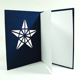
Here is the card base after you cut and score the card.
The layer is made from the same star that I used for the cut out in the card so it will fit perfectly on top of the cut out. You do have to pay attention to align the layer to the star because the design is not perfectly symmetrical. Just try various points at the top until you find the perfect fit and then put a pencil dot on the back of the top point to help you find it again once you have added adhesive.
I usually add a liner to make this type of card more practical for sending a message. I cut a piece of good quality, text weight paper at 8 1/4 x 5 1/4 and fold it in half. Then I put a strip of adhesive near the fold on the back of the card.
I place the folded paper on the front side of the card, making sure that it is centered and aligned with the fold. Then I fold the back of the card to the front and press along the fold to be sure that the liner is adhered.
This method gives you plenty of room to write, stamp or print your message and preserves the impact of the cutout image on the front of the card.
Here is another view from the top.
The contrasting star has a nice impact but could be "fancied up" a bit - with pen stitching, Stickles...
...or gems! I added these tiny diamonds at the tips of the star and a slightly larger gem at the center of the star.
You can download the .gypsy file HERE.
I wasn't online much today so I am a little behind on answering email and comments. I'll do my best to catch up tomorrow. I hope you are enjoying the long weekend.
Subscribe to Capadia Designs
Saturday, May 29, 2010
Star Card - Hiding Contours with the Gypsy
I have been having fun exploring the "new" Gypsy. The features that have been added are some that I have been waiting for ever since the launch last year. I designed these stars and a card with a star cutout using the Gypsy and the two exclusive Gypsy cartridges.
I started with this kite shape on the Gypsy Wanderings cartridge.
With a little bit of calculation (yes - math is helpful sometimes!) I determined that I could create a five pointed star by rotating the shape in 72 degree increments (360 degrees divided by 5 points equals 72). Then I aligned the shapes, using the outer edges as a guideline.
For the star shapes, I welded the five kites together. With the Gypsy, I was able to group the five shapes (even though they were at different degrees of rotation) and then quickly copy and paste ("duplicate" in Gypsy lingo) the entire group. This ability to group images that have been individually altered is one of the "missing" capabilities in Design Studio.
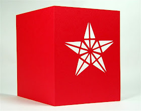
Here are the test cut stars - I was thinking of the Fourth of July when I made these but the stars could also be used for Christmas.
I used the "hide contour" function to create this card with the star cutout. In order to make this sort of design you just have to look at shapes and imagine the cuts that would result if the outline line of the design was not cut. This is one of my favorite types of card.
This screen shot is from Design Studio - the light blue lines are the hidden lines. On the Gypsy, the hidden lines will be gray.
I originally chose this shape to use for the base of the card. It appears to be a rectangle but I noticed it looked a bit odd on the Gypsy screen.
After I cut out the card and put it on my Scor-Pal to score I found out that the shape is definitely a bit off kilter. So I went back to look for a true square or rectangle that I could use to cut the card shape.
I found this square on the Gypsy Font cartridge (I was trying to create something that could be cut by anyone with a Gypsy and the two Gypsy cartridges are preloaded on every Gypsy).
I was able to trim the first card I cut to even up the sides making it just a bit smaller than standard A2 size. When I substituted the square from the Gypsy Font cartridge and cut the card again the size and shape were correct.
To hide a cutting line with the Gypsy, select an image and then tap on the icon that looks like two corners at the lower right of the group of buttons. The button can be selected if there is a purple line showing.
This screen will appear - the image is shown with one of the lines or contours in red. If you want to hide that line, tap "hide" on the right. If you change your mind the button will say "show" when a hidden line is selected and you can tap it to bring the line back. You can use the "prev" and "next" keys to scroll through the lines or click on the top left silver button to select each line in turn and then hide the ones you do not wish to cut.
Another great improvement in this Gypsy update is the ability to name the tabs for the layers and to "turn off " the layer so the images will not show while you are working on another layer. To do this you simply click the little eyeball on the tab to open or shut it. You can drag the tabs back and forth to rearrange the layers (the tab that is being dragged will turn green). The blue tab is the active tab and the pink tabs are the inactive tabs.
To label the tab, put your stylus on the tab without moving it and two choices will pop up - rename or delete. Rename will take you to the keyboard screen to type the tab name.
I have transferred the file back and forth between the computer and the Gypsy using the Gypsy Sync. I believe that the file is correct but one time I needed to redo the grouping and weld for the star cutouts. I am happy to share the file but I would like to ask for someone to test it before I put the file up for general downloading just to be sure that everything is working correctly after the transfers. You can just leave a comment or send me an email or message on Facebook.
Subscribe to Capadia Designs
Friday, May 28, 2010
Family Tree Title Page for Scrappy-Go-Lucky
This title page is meant to be used for a long overdue Heritage album that I will be making with some old family photos. I welded four corner elements from the Heritage cartridge to form the frame The wonderful swirly tree and the words are also from the Heritage cartridge.
This frame would work for many projects. I think it has an art nouveau look with the stylized swirls. You can see all of the details and download the free .cut file on the Scrappy-Go-Lucky blog. Here is a LINK to the post.
The big excitement today was the long awaited release of a major upgrade to the Gypsy. Here is a LINK to the site where you can get the latest information and download the new Gypsy Sync program. You can read the press release about the update HERE.
I was able to complete all of the updates successfully and I have been impressed with the upgrades. The most important addition (in my opinion) is the addition of "hide selected contour" to the Gypsy. I will definitely be using the Gypsy much more frequently with this feature added.
The price of the Gypsy has fallen drastically - I have seen several places selling it for around $100. With this latest upgrade I believe that the value of the Gypsy has risen to surpass the cost - the two exclusive cartridges are the icing on the cake (or should I say cupcake!). I'll be posting more Gypsy information and files to share now that I can use it to create the types of designs I most enjoy making (which nearly always involve "hide selected contour").
Have a wonderful holiday weekend - I started it off with a "Girl's Night Out" at the movies (you can probably guess which movie!). The weather is supposed to be beautiful here so we'll be doing lots of outdoor activities - but I will test out some Gypsy cuts sometime this weekend).
Subscribe to Capadia Designs
Thursday, May 27, 2010
Full Page Eyelet Lace Mesh
I have been spending a lot of time on figuring out technical issues for my new computer and trying to decipher the updates to Design Studio. I needed to take a break and create something to cut out! I haven't made any lace cardstock for a while so I decided to make a full page design.
I used this one element from Ashlyn's Alphabet to create the intricate design. Some images make wonderful patterns when they are repeated and combined in rows. Ashlyn's Alphabet has a quite a few interesting medallions and flourishes. This cartridge has a very European feel and there are welded phrases in several languages.
Here is a better view of the element I used - the keypad image for this is so tiny that it is difficult to see. This image is not perfectly symmetrical but it is close enough to work for this design.
By creating overlapping rows of this one image, and carefully aligning the rows, an entirely new pattern is formed. I think of this type of design as a mini-quilt since the same principles apply for the creation of secondary patterns.
I set the file up with four pages. The first is the actual welded design to cut. The second and third pages have the unwelded design and a plain 12 x 12 square to experiment with various color combinations in preview. If you leave the preview on the first page, you will see the dark black welded outline.
If you turn off the preview for the first page you will see something closer to the look of the final cut.
To choose the preview color for a mat and to turn the preview on and off, right click anywhere on the mat and select the appropriate options from the pop up menu.
My test cut worked perfectly. Be sure to use a good crisp cardstock that is not too thick. The design will take a long time to cut since it is so detailed. When you lift an intricate cut like this it is a good idea to work at a 45 degree angle. Most of the offcuts will stay on the mat if your mat is sticky enough. There will be some that you need to remove by hand.
The outer section of the cut cardstock will work as a frame for another page. You may want to trim the edges to even up the borders. It is nearly impossible to get the paper perfectly loaded to keep a design that is symmetrical centered on the mat the way it appears on the screen
You will also have 16 "suns" and 25 little flowers to use for other projects.
As you can see above and below, the color of the background makes a big difference in the finished look. You can also cut this design from patterned cardstock for an interesting variation.
I was able to use the new selecting feature in Design Studio to combine all of the rows of images and then checked weld just once for the entire group. I have been trying to decipher more about the way the update has changed Design Studio and I will add a few more videos if needed to show you the changes. Thanks to Kate who has been doing some testing with her computer and reporting back (see the comments to yesterday's post HERE).
Eyelet Lace Full Page
A couple of notes...
The Gypsy Update that was expected to take place on Thursday was put off and now will be available on Friday morning (Utah time). It sound like many positive improvements have been completed - here is a LINK to the official release by Provo Craft for all of the information.
Also, I want to remind you about the "Deal of the Month" at Creative Charms.
For a few more days you can purchase this collection of embellishments for only $8.99 - 65% off the regular price of $25.50. If you tried to purchase this already and found an unusually high shipping charge this was due to an error in their system which has been corrected. Shipping should be $3.99 or less depending on your location and size of the order. I recently joined the Design Team for Creative Charms and I have really enjoyed working with these beautiful embellishments - they often have given just the right "finishing touch" to a card or project.
I hope you have a safe and Happy Memorial Day Weekend!
Subscribe to Capadia Designs
Wednesday, May 26, 2010
Video Show and Tell on Design Studio Update
I made two videos to show you some of the changes to the Design Studio software in the latest update. Here is a LINK to my post a couple of days ago describing changes I have figured out so far. I must warn you that I have found that the program is behaving inconsistently - it seems that I don't always get the same results from doing the same actions. I will update my posts and videos as I become more familiar with these new features.
These are "exploration" videos - so think of them as show and tell for what I have found as of today I had a few unexpected things happen but I left the videos as they were so you could see that sometimes you truly do have to "play" with the software for a while to find out all of the tricks to getting it to do what you want to do. Unfortunately, while we seem to be getting closer to a grouping function, this update seems to provide just a basic "select all." At least it is a step in the right direction...
I ran out of time to demonstrate everything so I may add some more videos in another day or two. I have been using a new computer and had a few technical difficulties but I didn't want to delay posting these since so many of you had been asking for videos.
Please leave comments to let me know if you are having similar results in your experimentation with the updates. I'll post again as I find out more information about the additions to the program . I have heard that there will be a Gypsy update tomorrow so it looks like I'll be doing more "techie time" before the weekend. I may just go make a card or two for a break!
Click the You Tube logo in the lower right corner to "Watch on You Tube" to see the video in High Definition (720p) for the clearest image at full screen size.
Here is the second part:
Subscribe to Capadia Designs