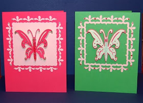
Thanks for your patience - today I can finally give you the details and the file for this card design. I went to the doctor today and the vertigo I had is due to fluid in my ears from my cold/sinus infection. I should be fully recovered soon - thanks again for all your kind words and thoughts.
The medallion border is made from this element on the Ashlyn's Alphabet cartridge.
Here is a closer view of the design. There are a lot of lovely flourishes on this cartridge.
I welded two images together and then created a square by rotating and aligning the four sides. I made two variations - one as a frame and one as a solid shape with a fancy edge. The outer rectangles are simply guidelines to indicate the size of an A2 card and are not cut.
Here are the two images on the mat after cutting.
When removed from the mat there are three usable pieces.
In order to create the solid shape, I used this rectangle, which is actually a blank card shape. When cut at 5.5 inches, this image will cut an A2 card with two tick marks for the score line. (If you read my blog regularly, you know I always remove those tick marks since I think they give the card a messy look - you can easily score an A2 card in the proper place without tick marks to guide you!).
In this case, I needed a square to fill in the opening and weld to the frame. I always try to use the smallest number of cartridges possible to create a design (I consider it a challenge!) so I adapted the rectangle to a square and used "hide selected contour" to eliminate the tick marks.
In this closer view you can see the adapted square added to fill the center of the frame and create a solid shape.
In this closer view you can see the adapted square added to fill the center of the frame and create a solid shape.
Here you can see the two shapes I created on the A2 base cards.
You could also use the center remainder for a card element turned on a diagonal. (I would probably add some more details to emphasize the edges - this was just a quick photo to show placement).
Here are the keypad locations of the butterfly image (above) and the butterfly shadow (below).
The shape of the butterfly was not quite right for my card - however, Design Studio makes it easy to adjust the shapes of images to suit your idea for a project.
On the right are the original butterfly shapes as entered from the keypad - I made them taller and skinnier by using the "handles" at the center right and bottom center.
Here are the images after cutting- I must have had scraps in these sizes ( it has been a while since I made these cards) - I could have just placed two three inch strips of paper in each color on the mat.
You can see that the interior cuts on the top layer are very thin.
The offcuts are a bit off center - sometimes I trim leftovers like these and use the negatives for another project. You can also save these and use them as masks for use with ink or chalk.
I added Stickles on the heads and bodies of the butterflies along with lots of small dots on the wings. I also added some dots of Stickles along the border.
You know how I hate to waste anything (!) so I save the edge pieces from sheets of foam squares.
They work perfectly to lift the body of the butterfly and keep the wings free.
I "auditioned" the butterflies on the opposite colors but I decided there wasn't enough contrast with the pale green butterfly on the pale pink solid medallion.
Here is one more view of the two card variations. By using different colors, patterned papers and varying the combinations you could make an entire set of these cards in coordinating scheme - they would make a lovely gift set.


OH my,I love them. Thanks for sharing
ReplyDeleteThis is just one of many things I love that you do!
ReplyDeleteWhen you have a moment, please pick up an award I have waiting for you on my blog. It's my way of thanking your for all you helped me through in LMSHTDT and the inspiration I've found in visiting your blog.
I hope you feel much better and continue to stronger! I was so sorry to hear you weren't so well.
Audrey Frelix
http://cuteandsome.blogspot.com
Great job!
ReplyDeleteI love the framing and the red cards "frame".
I'll have to try something like that. That's
why I love to hop and pop around to get
insprired.
THANKS BUNCHES! TR
Diane, You are a wonderful designer! I really like the butterfly cards. Thanks for sharing you ideas on designing them. I don't have Ashlyns Alphabet but I have other cartridges that I can use to create medallions and frames with. You have helped me so much with DS. I hope you are feeling better.
ReplyDeletei love butterflies. thank you for sharing. you are so talented. you make it look easy. i wish you were near me, so you could teach me, lol.
ReplyDeletechriswooten57
mcwooten1999@carolina.rr.com