Pages

Sunday, February 28, 2010

Butterfly Card variations


Thanks to all of you who left comments or sent me emails with get well wishes.  I am much better today but I took it really slow and need to get to bed early.  I found all of my notes for the butterfly card and realized it would take quite a while to write up so I will have to leave that for tomorrow.

I can let you know that the card was done with Ashlyn's Alphabet and I altered several images from that cart to create the medallion and the butterfly to fit an A2 card.  When you use Design Studio the creative possibilities are truly amazing.


I did have a few requests for the file for this scalloped lace square that I posted at the end of last month.  Here is a LINK to that post.  I have been trying to encourage my readers to try using Design Studio and create their own files by providing detailed explanations on how to make the files.  I have gone back to the post and added the file in case anyone is having trouble following my directions.

I hope to be truly back to normal tomorrow - thanks again for all the kind words and wishes!

Saturday, February 27, 2010

Pretty Pink Butterfly


It is snowing again here.  I am really ready for Spring to come.

I woke up this morning with an unwelcome problem.  I can't stand up without getting very dizzy - so I have been resting in hopes that this will stop the problem.  I haven't been out of my room all day so I had my husband bring my laptop so I could  post a little something (fortunately it is Saturday and he has been here to take care of me).

I made this card a long time ago but I don't think I ever posted it.  With luck, tomorrow will be a better day and I will share the details.  I wonder if you can guess which cartridge I used?

I hope you all are having a nice weekend and not too much snow!

Friday, February 26, 2010

Scalloped Ribbon - a quick explanation


I thought I'd do a quick post tonight to give a little more information about designing scalloped ribbon.  I had several people asking for help when they tried to create their own file for the scalloped ribbon on the card I posted yesterday. It is always a good idea to download the file and look at it, even if you don't have the cartridges that I used.  You may see that you can substitute a similar shape from a cartridge that you do own.

(If any of the screen shots are too small for you to read, just click on the image to see a large version)


There are lots of ways to create scalloped edges and borders in Design Studio.  You can work with circles and rectangles but it is faster and easier to use a shape that already has several scallops combined.  I used this rectangle from the Storybook cartridge for my ribbon.


It is important to keep all of the shapes in one group in order to be able to copy and paste and adjust the group as a unit.  Set the slider bar to one inch (the smallest size that you can set on the default size bar).  Then add as many items as you need to come close to your desired final measurement.


Next, click on a line of the second image and use the nudge arrows to move it to the left, aligning the scallops for a perfect overlap.


Continue to select and nudge the shapes until they are all overlapped.  Then check weld while the group is still selected (has the "handles" around it).


If you click on the eye to preview the image it will look like this.  The dark lines are the lines that will cut - the pale lines show some of the original shape sides that will not cut.


It is easier to visualize your final cut if you open a blank page in the file and view the preview from that page (the non-cutting lines will not show).


If you have not checked weld the preview will show in color.  This can be helpful in visualizing your design (and it is also a warning sign that your items are not welded).  I often set up two pages - one with the design welded and one with no welding - so I can experiment with colors in the preview.


There is a scalloped square on the Storybook cartridge but I did not use this because there is a noticeable difference in the height of the scallops at the corners

This LINK will take you to a post where I explained in more detail about overlapping the scallops to form a large square with tiny scallops and a way to avoid the uneven scallops where the corners overlap.


Another way to make a scalloped edge is to start with a strip or border piece such as this one on the Plantin Schoolbook cartridge.  I recently posted a scalloped lace square using this image to create the border - here is a LINK to that post.


You can switch to the 12 x 24 mat to give yourself some more room to work on the design.  You will be resizing the design to make it fit a card so you will be able to cut it on the 6 x 12 mat.


If you nudge the first three images together you will create enough "breathing space" to add a fourth border piece while the group is selected. You can then proportionately resize it using the lower right handle.  The result was still a larger bump for the scallop than I wanted for my project.


By keeping the piece in one box, you can now copy and paste and rotate the strip to create an evenly aligned row of scallops on each side.  you need to add a rectangle sized to make the ribbon the width you want.


By turning off the weld and adding layers on separate pages you can create a color preview of your design.  Be sure to select your scallop strip and check weld again before cutting!

I hope that this help those of you who were having trouble - please leave a comment or send an email if you need any more help.  If you made the card with the file I shared yesterday, I'd love to see your version.

Thursday, February 25, 2010

Believe Card (from the sketch)


Several people asked about the "file" for the quick sketch of the "Believe" card that I made to illustrate yesterday's post about card sketches.  The sketch was done with my CM StoryBook Creator Plus 3.0 software - it was not a .cut file.  Never one to turn down a challenge, I spent some time figuring out how to make a similar card in Design Studio.


This was the sketch I created using the StoryBook software.  I used papers from a digital kit called  "Cottage Garden."  I don't have that particular paper as physical paper and I decided not to print it out but instead used similar colors and textures from an older paper kit called "Starry Night."


The first problem was to try to find some word art that resembled the digital element I used for the card.   I used the keyword search in Design Studio and found three results for the word "believe."  None of them had the same look and feel that the word art in the StoryBook program had so I searched a bit more.  I looked for any prewelded words that might not be included in the Keywords (there are quite a few that are missing) but I didn't find anything.


I ended up choosing the "Matrimony" font from the Calligraphy cartridge.  I created my own welded word and adjusted the size to fit the card front.


I added a couple of swirls from the Calligraphy cartridge (I could have searched for some that were a more perfect match but I like to use the smallest number of cartridges possible to make it easier for people to use my files).  I chose not to add a flower as a cut - I knew I could add a Prima or other flower but in the end I preferred to leave the design unembellished.

I created the card base and layers in Design Studio, simply to use for preview purposes.  It is much more efficient to cut these layers with a paper cutter but it is nice to work with them for setting up the card.


Some people have trouble getting good cuts with the Calligraphy cartridge, particularly at smaller sizes since the letters are thin.  I used paper from this "shimmer" stack by DCWV.


It is a medium weight with a "hard" finish and I found that it cut very well at blade 6, pressure max, speed max (though actually controlled by Design Studio).


Next I needed to create the scalloped ribbon strip.  I tried using the strip from Plantin Schoolbook but I ran into a problem.  I thought that three images welded together were not quite "bumpy" enough and I could not put four in a single selection box even when I switched to the 12 x 24 mat.  So I looked for a scalloped square that I could weld into a ribbon strip.


I tried the scalloped square from Mini Monograms but it was too irregular for my taste.

In the end, I used this scalloped square from Storybook, overlapping and welding seven together.


I was able to get a small tight scallop for the strip to go across the card.  It is definitely a smaller scallop than the one in the StoryBook sketch but I liked the way it looked.


I created additional strips to layer on the scallop.  When I was done I realized that everything was too high on the card.  It doesn't really matter since there are actually only two items that will be cut from the file - the word art and the scalloped strip.  However, I wanted to make a Design Studio "sketch" that looked similar to the StoryBook sketch.


The easiest way to move all of the design elements to a lower position and retain their spacing, is to add the same amount to the "Y' value for each item.


I added .3 to each to get my design into a more pleasing proportion.  When I actually assembled the card I placed the items a bit lower.


Here are all of the components of my card.  I cut all of the layers with a paper cutter.  The dimensions are listed on the tabs of the file.  If you don't have the Storybook cartridge but you do have a scallop edge punch you could use that to create the scalloped strip and just cut the word art with the Cricut.


The scalloped strip in the file is 5.5 inches wide to allow room for trimming to a straight end.  First I added the gold layer.


Then I added the green strip.  I checked the measurements on the card front.


Here is the trimmed strip that is sized to fit the first layer (5.25 inches wide).

Now I have a nearly finished card....


I always use my Creative Memories Precision Point Adhesive to adhere delicate cuts like this one.  I have tried other glue pens but  like this one the best and always have great results.


Be sure to keep track of the tiny dot for the "i" (but if you do lose it you could always use a gem!).  It is easiest to put a bit of adhesive on the card in the position where the dot will go and then add the cut piece to that spot.  I wait until the adhesive has turned clear so it doesn't ooze out at all.
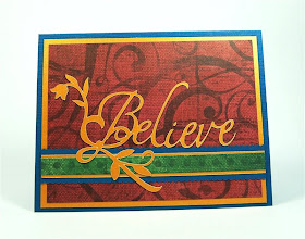

So here is my final card.  Similar, but not identical to the sketch I made in the StoryBook digital scrapping software.  (It is a bit confusing - the CM software is StoryBook and the Cricut Cartridge is Storybook - no capital "B").  The file is available to download as usual.  There are ten tabs in the file but only two that you will actually cut with the Cricut.  You can cut this file with any of the machines.  You NEED the Calligraphy Collection cartridge to make this card, the Storybook cartridge for the scalloped strip is not essential - you could try another scalloped square welded into a strip or simply use a border punch.  George is used only to make the shapes for all of the plain layers and the card base for previewing.


One more tip - when there are so many mats that the tabs will not fit on your screen you need to use these arrows to scroll through the mats.


I am a Creative Memories consultant and I am happy to answer any questions about the StoryBook software or any other products if you do not have a consultant already.  I consider it my other essential crafting tool right next to the Cricut and Design Studio.  The link to my personal website is HERE  (and always in the side column of my blog).

Wednesday, February 24, 2010

Some more information about Card Sketches....


Several people have asked me to explain more about making card sketches.  I do this in two ways - using Design Studio or my Creative Memories StoryBook Creator Plus 3.0 software.  Each has some advantages and disadvantages. 

You can use Design Studio or the Gypsy to plan a card (or a page layout) and determine the correct size for all of your cuts.  By working on the virtual mat you can avoid cuts that are too large or small  - you won't waste any paper and all of your cuts will be "just right."


In Design Studio you can do color previews of the full card but it is a slow process.  This card took eight mats (plus a preview page) to set up.  You need to plan ahead and figure out how many layers of color you need since each mat will only preview in one color.  It can be very fiddly to get everything lined up correctly and then move the layers to different mats so they will preview in the correct colors.  Design Studio will preview the images top to bottom from the first mat so you have to be able to visualize all of the layers in the proper order as you set up the mats


You can put some information on the mat tabs but I find it easier to take a screen shot and then add the notes on the screen shot.

 
When I use StoryBookCreator Plus 3.0 (Creative Memories) to plan the card, I have the option of changing the color of each element in the design while they are all on the same page.


I can group the entire design and then copy and paste and edit the second design to try variations (such as splitting the scalloped ribbon band and moving the pieces to the top and bottom of the card. 


I can also use digital paper to fill in the various elements.  In Design Studio I am limited to solid colors and I can't easily save any custom colors that I create.


I do not have a digital library of the Cricut shapes to work with in the StoryBook program.  I can take screen shots and create them but this is a slow and tedious process.  I can use elements from the program to represent the types of cuts I might use but I will still have to work with the items in the Design Studio program to get the sizing to be perfect.

When I make a "sketch" or card plan in Design Studio I will have created a file that I can use to cut the elements of the card.  If I create the sketch in the StoryBook program, I can be very specific about the sizes but I will have to "transcribe" the measurements into my Design Studio file.

For either program, It is important to understand how to create precise sizing and placement on the mat.


In Design Studio, you can enter the values in the Shape Properties Box.  This screen shot is for the first mat layer on the Easter card.


In the StoryBook Program, you select the element you want to work with and then right click and choose "Properties" from the bottom of the drop down menu - this screen will pop up. This screen shot is for the second mat layer on the card.

For both methods you need to first create a rectangle in the size of your card as a base (4.25 x 5.5 inches for an A2 card) and then work on adding additional elements of your choice.  In Design Studio you can use any rectangle to create the base that represents the card.  You will not be cutting this from the program but will simply cut an 8 1/2 x 11 inch piece of cardstock in half and fold it to form your card base.

Please let me know if you have more questions and I will try to help.  There are definite advantages to working out your designs on the computer, but if it gives you difficulty there is nothing wrong with the" pencil and paper" method - just have fun creating!

Tuesday, February 23, 2010

Checkerboards and Charms


I wanted to make a few more cards to highlight these cute beads and brads from Creative Charms.  I was using Graphically Speaking for another project and noticed this grid.


This can be used to make a sports goal when combined with the shift of the key which creates the crossbars.


Here is a closer view of the image straight from the cartridge.  I wanted to use this for an A2 card topper.


I adjusted the width and height to make the grid 1/4 inch smaller than the card on each side.


Then I used "hide selected contour" to eliminate some of the interior cuts.  I did this in two different patterns.


This is the preview of the two versions.  I added two rectangles (using George) just to create a background for previewing.  You do not need George to cut the file.


These are the beads I wanted to use.  They are easy to attach to the card with a glue dot.  They also have a hole through the center so they can be threaded.  


I used a few of these beads at the ends of the strings of hearts on the mobile I made for Valentine's Day (here is a LINK to that post - the mobile is in the second part of the rather lengthy post!).


I cut the card toppers from some patterned cardstock first but I wasn't happy with the level of contrast.  For my second try, I used this blue shimmer cardstock and I liked the effect much better.


I used my CM Precision Point adhesive pen to make sure that all of the spikes at the edges would be well secured to the card front.

 
For the first card, I simply added a circle of pink flowers with a clear butterfly in the center.  I put the glue dots in the center of each open square and then placed the beads in position.


For the second card, I added some pink glitter cardstock underneath the center grid.  I cut the glitter cardstock piece at 2 1/2 x 3 1/2 inches.


I punched a hole in the center of the grid to prepare for the white butterfly brad.  I used the CM Adhesive pen for the spikes again but added glue dots to the solid squares to hold the glitter cardstock firmly.


I put the white butterfly brad through both the blue and the pink layers.  Then I added some strong double sided adhesive to secure the topper to the card.


Here is a view of the two card variations together.  There are many more possibilities with this design.

Here is a LINK to the page on the Creative Charms website for the "Gem Garden" beads.  


This LINK will take you to the page with the butterfly brads which come in six colors and are packaged with six sparkly floral beads.

If you download the cut file I'd love to see what you make.  Be sure to check out the Creative Charms site - they have a lot of lovely embellishments to enhance your projects and the prices are quite reasonable.  I will be sharing more projects made with the items they sent for me to preview very soon.