Pages

Sunday, January 31, 2010

Scalloped Lace Square


This beautiful lace can be found on the Mother's Day mini cartridge.  The image on the cartridge has plain  edges.  A friend from the Cricut Message Board was have difficulty trying to add the scalloped edge. I put together a file and thought it would probably be helpful to others to show how to do this.  Remember, you can click on any of the images to see  a larger view.


The scalloped edge can be created quickly if you start with this element on the Plantin Schoolbook cartridge.  Start with the size at 1 inch (the smallest that can be set on the slider bar).


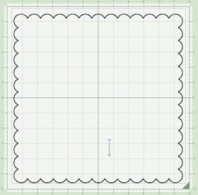
The lower image shows the shape as it is entered from the cartridge.  You need to switch your mat size to 12 x 24 in the program to allow enough space to add three of these in one selection box.


Here are the three sections as they will appear on the larger mat.


Use the nudge arrows to move the second and third sections to the left and overlap the scallops.  Be sure to check weld while the border is selected.


Then resize the border using the handle in the lower right to keep it in proportion.  After you have created the border you can copy and paste it three times, rotating each side to create a scalloped frame.


Pay attention to the corners to be sure that they are evenly aligned.


Once you have formed the frame preview the file - it will look like this.  If you want to create a blackout version of the design you can add a square to the center of the frame.  Be sure to check weld on the square.


If you add the square after the frame is complete and preview you will see something like this.  The weld is not working correctly but you can quickly fix it by copying, deleting and pasting back one of the borders.


This is how the correctly welded shape will appear in preview.  If you place three sides, then the square and then the fourth side border you will not need to "burp" the frame.


This is the lovely lace image on the Mother's Day cartridge.  


The same principle applies to adding the lace square inside the frame.  If you add it when the frame is complete you will need to "burp" the frame again.


After "burping" your framed lace will look like this.


I made a test cut of the design using this paper from SEI.  The Michael's store near me had it on sale for $4.00.  The paper is called Madeline and has lovely soft colors and lots of shimmer.  There is also some solid cardstock in the stack.


After cutting the lace, the outer edge of your 12 x 12 sheet of paper will look like this.  Notice that the sides are slightly uneven - this is due to the small discrepancy in the accuracy of placing the mat into the rollers.  Even though your cut is perfectly centered on the computer screen it will usually be a bit off center.


If you trim a little sliver (about 1/8 of an inch) from the two fatter sides you can use the frame on a plain 12 x 12 for another layout.


The full frame on a dark gray page from the stack.


Here is a closer view of the corner.


The paper has a beautiful sheen but it is tricky to photograph.


The background color makes a big difference in the overall look.


You can even layer the cut on a tiny overall print - this one is also from the same stack.


You could use the frame and the lace to make a two page layout.


This photo shows the shine of the paper a bit more clearly.

If you have welds that don't work out the way you pictured them you should always stop and think whether you may need to rebuild the design or "burp" a frame.  The order in which the elements are added to a design can make a difference in the final results. 

Scalloped Lace Full Page

Mysteriously and miraculously my computer decided to recognize my Cricut again today so that was a big relief!  I restarted the computer several times yesterday with no luck, but today when I turned on the computer and plugged in the mouse all was well - go figure!  Thanks for all of the help suggestions.

Saturday, January 30, 2010

Vintage Valentine


I made this card recently and I was very happy with the way it turned out.  The image is one that I was taken by the minute I saw it.  I have always liked topiaries and the little hearts are just charming!  I did some editing and resizing to make it work for my card.  The image is from Twisted Papers - here is a LINK to the page.

I was planning to post the details and file for the card.  However, my computer has stopped communicating with my Cricut and I have been trying to resolve this problem.  I think there must be an issue with my USB ports but I have no idea what caused it and so far I have not been able to fix it.  One minute everything was working and the next it wasn't.  I can't use my wireless mouse either which makes me feel clumsy and frustrated so I won't be able to do a full post for today.

So enjoy the pretty picture and send some "good vibes" my way.  I have so many things to do this weekend and I need to use my Cricut with Design Studio for them.  My fingers are crossed that tomorrow will be better.

Friday, January 29, 2010

Flamingo Valentine


I hope this Valentine makes you smile - I had a lot of fun making it! I have several friends who are "into" flamingos (you know who you are!) and I think there are many others who find them amusing.  The file is made with Life is a Beach and George.  If you don't have George you can use the George heart as a pattern and adapt a heart from another cartridge to fit.


 The original shape was a bit too wide to have two fit comfortably on an A2 card so I adapted the shape.  I also lengthened the shape in stretched the neck a bit.  Then I had to adapt the layers to make it all fit.


There are several mats in the file.  I have labeled each mat with the size of paper you need to cut the various pieces. There is no blackout or shadow version of the flamingo so I created my own blackout using "hide selected contour."


I set the file up on a 12 x 6 mat but if you have an Expression you can put all of the papers on your12 x 12 mat as shown above (please ignore my dirty mat - I need to clean it!).  Then just turn and reload the mat to cut the page with the blackout.  The heart is on a separate page so you can set that page for multi cut x2 if you use glitter cardstock as I did in this sample.  If you are using regular cardstock, just copy and paste it onto the mat with the flamingo layers to be more efficient.


Here are all of the cut pieces.  The legs are extremely thin and delicate and you could cut off the black layer at the top of the legs if you don't like the slight shadow effect you will get after embossing the yellow layer.


I used the "Mesh" Cuttlebug folder to emboss the legs and I put the legs in upside down so the raised bumps would be on the top.  For the flamingo bodies I used the "D'Vine Swirl" folder and carefully positioned the cuts so the swirls would fall in interesting and logical places.


I put adhesive on my blackout base layer and added the embossed yellow layer on top - this helps keep the embossing intact.


Once these layers are together you can see that the black layer shows a bit - I don't mind this since it actually helps the legs stand out against the card background.  If it bothers you,  just trim off the black legs before assembling.


The card base is an 8 1/2 x 11 piece of cardstock cut in half in portrait orientation to make two pieces 4.25 x 11.  This is scored and folded in half with the fold at the top.  The next layer is the same deep pink cardstock that I used for the flamingo bodies and it is cut at 4 x 5.25 inches.  The top layer is cut from a piece of cardstock from the DCWV "Sweet" stack that has a border design - I just wanted this sparkly curlicue background without the border design.  This layer is cut at 3.75 x 4 inches.


Be sure to figure out the placement of the heart using the flamingos as your guide and adhere it to the top layer before adding the flamingos.  I added tiny black gems for their eyes.  I thought the black in the beaks looked a little harsh so I tried some orange Stickles to fill in the cut areas.


The Stickles look much better in person than they do in the photo!  I think they were still a bit wet when I took this.

If you download the file and make this card I'd love to see how yours turns out - thanks!

Flamingo Valentine

Thursday, January 28, 2010

Road Trip (not a particularly "crafty" post)


I often talk about my trips back and forth to New Jersey and Pennsylvania.  I was born in Bucks County, PA and my Dad still lives there.   Our younger son goes to college in New Jersey, not too far from my sister in Montclair, so I usually combine trips to college with visits to my Dad and my sister.  The route I take from Massachusetts takes me through Hartford, Connecticut on Route 84 and down through Westchester County, New York on Routes 684 and then 287 crossing the Hudson River on the Tappan Zee Bridge.

I have traveled this route many, many times and there are occasions where the traffic or weather is terrible but on this last trip it was a bright sunny day and the conditions were great.  I reached for my little "purse camera" (KIDS - don't try this at home!) and tried to shoot a few photos while I went over the bridge.  Call me crazy but the years of crossing this bridge and some of the stories I remember (such as the year it took nearly four hours to get from the 684/287 interchange to the bridge - a distance of about eleven miles!) are things that have significance to me and my family and I would like to include those memories in a scrapbook.


The bridge is just over three miles long. and most of it is low and close to the water but it rises dramatically on a cantilever span to a clearance of 138 feet over the water.  This photo is from the approach to the bridge and shows both the low and high sections.

Here is a view of the girders of the main span - just like a giant erector set.  Once again, it was a crazy whim to snap these photos but I actually had both my hands on the steering wheel along with the camera!  The bridge is seven lanes wide with a movable "spine" that is shifted back and forth to give more lanes in the prevailing commuting direction (eastbound in the morning and westbound in the evening).


The bridge is about 25 miles north of New York City and on a clear day you can see the skyline.  (One of the benefits of a good photo editing program is the ability to "clean up" a photo taken from a moving car!).  There is a lot of talk about a new bridge.  The Tappan Zee was opened in 1955 and was designed to last 50 years so it is on borrowed time.


I was thinking about the meaning of "Heritage" (can you guess what new cartridge I just received in the mail...?).  I am working on a project with this photo of my grandmother when she was about 18 years old.  While most people think of ancestry and family trees when they hear "heritage" there are all sorts of things that make up your family heritage - including stories about 11 mile long traffic jams on the Tappan Zee bridge!

I'll be back to crafty things tomorrow - thanks for listening to my "bridge story."

Wednesday, January 27, 2010

Martha's Pansies


I bought a magazine called "Stamper's Sampler Take Ten" at Borders a couple of weeks ago.  It was a surprise that it cost $14.99 (magazines cost more than books sometimes!) but I have really enjoyed looking at all of the cards and ideas.  Here is a LINK to the web page for the magazine (along with a lot of other interesting publications by the same company).


There were quite a few cards based on a challenge which involved a basic A2 card (5.5 x 4.25 inches) with a strip removed from the front and the corners rounded.  I liked this style of card so I decided to give it a try.


Another recent purchase was this new Martha Stewart Pansy punch around the page set.  I have always loved pansies and I fell in love with this design - I am sure you will see it in many future projects!


When I made the card base I ended up with a one inch strip just sitting on my table - so I had to try the punch on it!  Here you can see the design I made by punching the strip from both sides evenly.


Then I started to experiment with different widths of paper strips.  The example at the top is a one inch strip and the one on the bottom is a one and a quarter inch strip.


I tried the punch on some DCWV glitter cardstock and it worked well.  I trimmed the ends straight and then decided that it would be a better idea to try to curve the cuts to make the flower petals.


Here you can see another dark purple strip where I did not make the straight cut and trimmed around the petal ends for a more pleasing cut.


Here are all of the pieces for this card.  The dark purple strip is 1.25 x 4.25 inches.  The pink cardstock is cut at 3 x 4 inches with two corners rounded to match the card base and embossed with the Cuttlebug Swiss Dots folder.  The pink glitter cardstock pansies are evenly centered and punched on both sides of a 1.25 inch strip and then trimmed.  The dark purple pansies are punched from a one inch strip of cardstock and trimmed.  The "love you" and the interlocked hearts are from the Cuttlebug Embossing and Die Set "Love Language."


 Here is the card with the base layers applied.  There are so many possibilities with this basic card form.


Here is a view of the assembled card flat on the table...


...and one more view of the card standing.

I got home after a long drive Tuesday so I can finally get caught up with a lot of pending projects and emails.  It will be nice to stay put for a while!