
I did another test cut of the Beach Party card and it cut perfectly. As I mentioned a couple of days ago, I had the file ready to share but then noticed that the line between the "e" and the "a" on my second test cut was very thin (as you can see below).
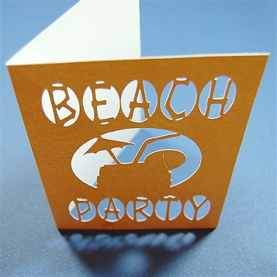
I am not sure why that second cut was "off." I occasionally have files that cut perfectly once and then imperfectly in the same cutting session. After checking the files to be sure that the design is correct, I can often get a good cut again simply by closing and reopening the program
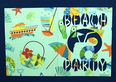
For this test I used a K & Co paper with a very cute beach theme. You need to add a liner if you plan on printing information or writing a message on the inside of the card.
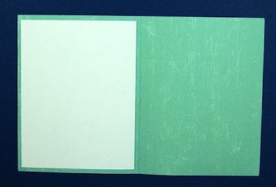
Since the paper I used for the card was double-sided, I just cut a piece of paper to 4 x 5.25 inches to adhere to the inside front of the card.
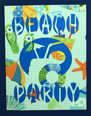
The paper was dark blue on the front side. If you use a patterned paper for the card design, it is important to have a strong contrast for the liner.
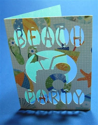
The multiple openings make a very interesting card front.
I also promised a quick tutorial to show you how I designed this card. The key to making this work is the use of "hide selected contour." I always try to find ways to use my cartridges efficiently and I enjoy the challenge of trying to make a new design using as few cartridges as possible. Since there is not a plain rectangle on the "Life is a Beach" cartridge, I used one of the square cards for my basic card shape. I chose one with only a few contours to hide to keep things simple.
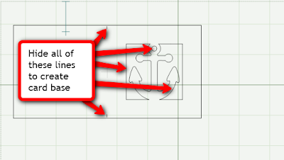
Hide the interior contours as indicated above. Remember, to hide contour you left click on the line you want to hide - it will turn red and dotted to show that it is selected. Then right click anywhere on the mat and click on "hide selected contour" at the bottom of the pop-up menu. The line will turn a very pale blue. I always hide the "tick marks" on the cards which are included in the design for the location of the fold - I don't care for the little cuts that show on the final fold. Once all of the contours are hidden, adjust the size to 8.5 inches wide and 5.5 inches high using the Shape Properties Box.
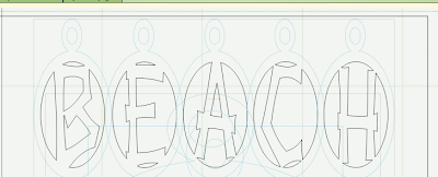
For the words, use the "charm" feature and nudge the letters together until the circles overlap. Then hide the outer line and the hole of each charm.
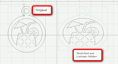
For the center of the card, I used one of the images in the charm feature but stretched it a bit to make the opening an oval rather than a circle. You can choose any of the images for the center and then hide the outer line and the hole of the charm again.
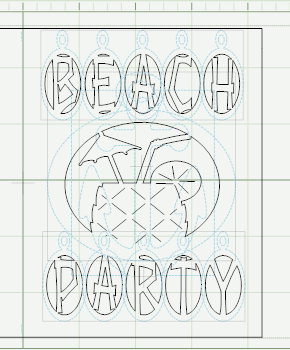
In this screen shot you can see the large number of hidden contours (all pale blue lines).
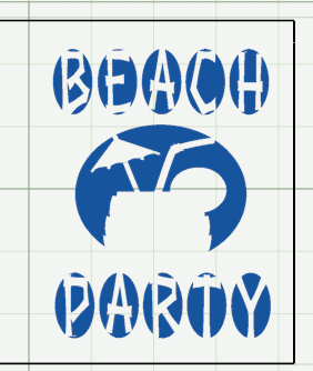
This preview shows how the design will look when it is cut. By previewing on a blank page you can see the design without all of the distracting hidden contour lines visible in the preview.
I have designed many cards using this method - I will share a few more of them soon, but why not try making some on your own? It really is very easy and it is so much fun to think of all of the possibilities.
(We still have some openings in the Word Book Class on Wednesday 7/15 at 1:00 p.m. Eastern and in the Basic Cards Class on Thursday 7/16 at 1:00 p.m. Eastern - registration directions are linked HERE).
Beach Party A2 Card

No comments:
Post a Comment
Thanks for taking the time to leave a comment. I love to hear from the people who read my blog. I moderate all comments to keep spam off the blog without making you decode the squiggly letters so your comment may not appear immediately.