Pages
▼
Friday, July 31, 2009
Whitewash Embossing
I really have become fascinated by the Core'dinations cardstock. Earlier this week I shared a card I made using the "black magic" variety (here is a LINK to that post).
Today I thought I'd show you the "whitewash" Core'dinations cardstock (here is a LINK to their site where you can see all of the varieties).
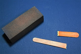
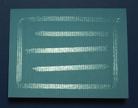
When I did the "black magic" card, I used this sanding block - which was really too fine a grade and it made it difficult to remove the color quickly. A blog reader (hi Marjorie!) wrote to me to say that she had used an nail file (emery board) and that it worked very well. So I tried that and it was faster and easier (I did break it as you can see above!).
When I went to get a link for the Core'dinations site I discovered this tip on the home page:
If you really want to get the most out of your new Core'dinations ColorCore Cardstock make sure you sand it with 150 or 180 grit sandpaper. If you're using another grit, you're either missing out on the vibrant ColorCore or causing yourself extra work!
It always pays to read a manufacturer's site to find their recommendations for using the product! So for my next card I will raid my husband's workbench to find the right sandpaper.
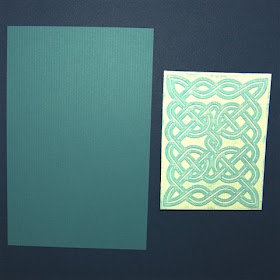
I used my new Celtic Knot A2 cuttlebug embossing folder. I cut the piece of Core'dinations whitewash paper to 4 x 5 1/4 inches to layer on an A2 card. I had some Bazzill cardstock for the card base that is very close in color to the core color of this piece of Whitewash cardstock.
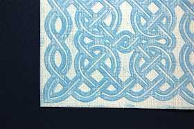
Here is a closer view of the embossing and sanding.
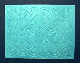
This is a complicated design and it looks good from both sides - there is embossing and debossing on each side to create the pattern of the knot.
When I want to put an embossed layer on a card I put the adhesive directly on the card base so I won't press too hard with the tape gun and flatten the embossing.
Since it is difficult to get the tape exactly where the corners will fall on the card, I put a small glue dot at each corner to keep the corners firmly adhered.
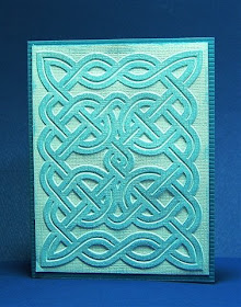
This design will work for a vertical (above) or horizontal (below) card.
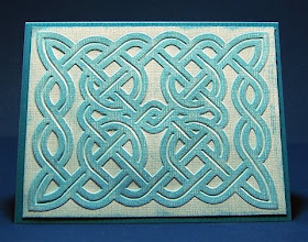
I thought the design was so pretty that it would be best to leave it plain with no embellishments. These would make lovely notecards.
A Few Notes...
No one has correctly guessed the cartridge or cartridges I used for the design I posted yesterday. I will add a few guesses that came by email rather than a comment so you can see all that have been suggested so far. I did not have a chance to test cut this design yet but I am confident that it will cut nicely
Jen and I have scheduled three classes for next week - with our time off for medical/personal stuff last week we didn't allow enough time this week for sign ups so we moved the classes ahead a week. We expect to have some new and different classes ready to go for the following week (we know that there are a number of you who have taken all three classes and are waiting for some new ones to be available). If you want to take the Getting Started , Basic Cards, or Wordbooks classes please register following the directions on the Let me Show you How to Do that blog.
I have recently received a couple of interesting packages in the mail - check back in a few days to see what was in them and what I do with the contents! (I wish one was a Gypsy to test - but no such luck...).
Thursday, July 30, 2009
Another Mystery Design....
I was searching through my files for a design I made for one of my current "secret" projects and I stumbled across this file - I reworked it and I plan to test cut it tomorrow. I think when I made it I was working on an idea for a 60's ATC swap and I thought it had a "mod" look (but I ended up doing something else for the ATC).
I thought I'd post it tonight and have a little contest. I haven't posted a "mystery design" for a while. The first person who leaves a comment on this post and correctly guesses what cartridge or cartridges I used to create this design will get a prize from me. It won't be anything as exciting as the Gypsy but it is just for fun! (If you haven't checked the Cricut Message Board, the Gypsy winners have been drawn - I was not one of them but I want to say congrats to the winners - how exciting for them!). If you don't know about the Gypsy yet - here is a LINK to the official site.
This design is intended to be used as a card topper for a 5 x 7 card. All sorts of color combinations are possible for this funky background. I can't wait to show you what I have been working on - I will reveal it as soon as I can...
Wednesday, July 29, 2009
A New Punch (but thinking about the Gypsy...)
I spent a little time today working on more "secret" projects that I will soon be able to share. I didn't have much time to spare since there were lots of errands that I had to take care of today. This week is very busy since it is the final week of the Arts Camp where my son is a counselor this summer and there are performances every night (we try to go to most of them).
One of my errands took me very close to a Michael's store, so, naturally, I had to make a quick stop to check their sales. I have been thinking that I'd like to get the Hannah Montana cartridge (hard to believe since I have grown boys - not tween girls, but I do like all of the musical items and fonts). At the $40 sale price I can talk myself into any cartridge! They did not have it, they did not even have a spot for it....so I took a look around and found this punch on a clearance rack.
This is the Martha Stewart pop up cosmos punch. It was marked down to $6.99 on the sticker - but it rang up at $4.99 and I had a 40% off coupon so it cost me only $3.00
I really like the look of the flowers partially punched through the paper - you can raise up the petals for a pretty effect. I actually had been working on a design for something similar in Design Studio a long time ago and I feel inspired to try to finish it up now!
I was planning to use this row of flowers to make a card, but that will have to wait for another day. In the little free time I did have today, I was reading up on the new Gypsy device - here is the LINK to the official site where many questions are answered. Some lucky people were given coupons for a free Gypsy at the CHA (Craft and Hobby Association) Convention and Trade Show that is going on right now in Orlando, Florida. Provocraft is also giving away three gift bags from the convention on the Cricut message board - this LINK will take you to the thread where you can enter your name in the drawing. Good Luck - be sure to post before 10 a.m. mountain time tomorrow (Thursday).
Several people asked me if I knew the price. I have seen both $399 and $299 posted as the suggested retail price. There are many sites taking preorders already for about $250. There are a variety of accessories, such as "skins" to protect the device (and look cute) and car chargers, etc. ,that you may feel are necessary add ons, so I imagine that many people will end up spending $300 or more to get their hands on this device.
I haven't seen an answer yet about the compatibility of .cut files created with the Design Studio software with the Gypsy and I am eagerly waiting to hear if the long needed improvements to the Design Studio program are now ready since, it appears that Gypsy has some of the functions that we have needed in Design Studio from day one.
I am eager to find out more (and excited to see who will win the Gypsy gift bags - Good Luck!)
Tuesday, July 28, 2009
Video - "Hide Selected Contour"
It has been quite a while since I posted a video. There just aren't enough hours in the day and I have had a lot going on! Lately, I seem to be getting lots of questions about the use of the "hide selected contour" option in the Design Studio software so I made a quick video to explain how to use this design tool.
If you are using a cartridge that does not separate the layer options by color, "hide selected contour" can help you save a lot of paper and make your cutting very efficient. In this video, I explain how you can separate your layers to cut each item from the proper color by using "hide selected contour."
This is the basic information on using "hide selected contour." If you are a regular reader of my blog you know that there are many ways to use this feature and there are also a few "tricks" to get the function to work in various situations. I will be adding a few more videos to explain these quirks. (I will try to get those done without another long time gap!).
Now I have to go read all about today's big reveal of the new Gypsy device - I am very interested to find out more about it. You can check it out HERE. Let me know what you think.....
Monday, July 27, 2009
Elegant Embossing
I recently purchased some Coredinations paper at Joann's when they had a sale price of 6 sheets for 96 cents. This paper is made with a "core" of one color with another color on the surface. The paper comes in several varieties with different color combinations. It usually retails for 50 to 60 cents a sheet so this was a great price. Here is a LINK to the Coredinations website if you'd like more information about this paper.
I used the type called "Black Magic" for this card - the surface is black with another color below - in this case red.
I embossed a piece of the cardstock using my new "Victoria" Cuttlebug folder. Then I sanded the paper to remove the black layer and reveal the red on the embossed areas. I found the sanding took a while and I did have a lot of dust on my table when I was done. I ran the paper through the Cuttlebug a couple of times to enhance the embossing after sanding it for a while. I still didn't get all of the black off the raised areas but I think the effect is pretty.
I decide to use my sample piece to make a card. I used a dark green cardstock for the card base. I added a couple of pieces of white satin ribbon - taping them to the back of the embossed layer.
I tied a couple of short pieces of ribbon to the horizontal ribbons on the front of the card to imitate the look of actually tying the knots. It is much easier to get a nice effect by doing it this way (Robyn, The Pink Stamper, calls this the "cheater method").
To keep the ribbons in position, I placed a small glue dot under each knot.
When I add an embossed piece to a card, I always put the adhesive on the card itself and then add the embossed layer - it is too easy to "erase" or flatten the embossing with your tape gun if you apply the adhesive directly to the embossed layer.
I had a couple of embossed angels left over from my June ATC swap (above is a photo of that ATC) so I decided to use one for this card. With the dark green cardstock and red layer it was starting to have a "holiday" look. The angel is from the Joys of the Season cartridge.
The angel was embossed with the "Textile Texture" Cuttlebug folder. I used foam squares to raise the angel and make her "fly" on the card front.
Here is the finished card - very simple, but still interesting with all of the colors and textures. It is always fun to try new products and techniques - I think next time I will use a coarser grade of sandpaper and see if that makes the color removal quicker and easier.
For those of you who have been asking, Jen and I will be teaching a couple of Design Studio classes on Thursday and Friday this week- details are available on the Let me Show you How to Do that blog.
Sunday, July 26, 2009
Borders from A Child's Year
I realized that lately I have been posting a lot of cards so I thought I'd share a couple of borders today. These were made when I was first trying out A Child's Year in Design Studio after the program was updated with new cartridges.
I welded together some teapots and added the words "Tea for Two" to cut out from the teapots
I used the initial medallions to put a letter in the center of each teapot. By sizing the medallions to overlap the teapot by just a tiny amount I was able to prevent the scalloped oval from cutting as you can see in this preview.
Unfortunately, the letters in the medallions are not "stencil" type letters which means that you need to keep track of the tiny centers of letters like "o" and "a" and glue them into position.
When working with these tiny pieces, I find this tool helpful. It is from Quick-Kutz and is called the Quick-Stik.
You take the cap of the top and there is a sticky substance that helps you pick up the small bits of paper.
You can then place the bit of paper in the proper position and use the opposite end of the tool to make sure the paper is positioned correctly. (The pieces are tiny - the center of the "A" is that little triangle you can see at the bottom of the photo).
The centers of the "O" were large enough to put the adhesive on the cutout piece, but for the tiny bits for the "A" and the "R" I put the adhesive on the background paper and placed the tiny cut on the adhesive spot.
You can see how tiny the letter "A" center is in this photo!
Even the full letter cut outs are tiny and easy to lose - I have no idea where the "F" is!
Once you finally get the centers in position the border looks like this.
I also did a simple scissor border. I have lots of sewing and quilting photos to use for layouts and I thought this would make a cute page accent.
The cut has a tiny hole for the hinge of the scissors - at this size it is so small that it did not cut cleanly.
I recommend using "hide contour" to eliminate the holes. Unfortunately, there is only one contour to hide so you will have to rehide the holes each time you open the file (I put a note on the page tab as a reminder).
Here you can see the second test cut - the scissors look fine without the holes.
I also test cut the teapot border again. I was using the textured DCWV paper and it did not cut nicely at this size - I find that paper is better for large cuts without a lot of detail. I also do not like the look of the white core on these intricate cuts.
I didn't even bother to place the missing bits in the letters on the second cut. I decided that it would be better to redo the file using a font with a stencil feature.
I chose the "Alphalicious" font using the crown tag option. The two pieces of the design are individually adjustable (the teapots and the letters). When you first enter the "Tea For Two" phrase it is spaced as you see above. I needed to use the kerning control to speed up the process of fitting the teapots and letters together. (Kerning is simply a way to describe or define the amount of space between letters).
I could use the nudge arrows to move all of the letters into position, but, by using the kerning and applying a positive number (.5 as shown above) instead of the negative number I would usually use to bring the letters closer together for welding, I was able to quickly move the letters to something close to the proper position.
Here are the letters after I applied the kerning.
I fine tuned the placement using the nudge arrows.
In this close view screen shot you can see all of the hidden contours that allow just the letter to cut out from inside each teapot.
The stencil letters have "bridges" that hold the centers in place so the letter is still legible. Here you can see the both the "O" and the "R" with the tiny connections to the center.
Here are the "leftover" letters on the mat - they are extremely thin and delicate but could be saved to be used on another page.
I like the look of this border better - and I really like the way the letters remain intact due to the stencil type image I chose for the centers.
I am including files for both borders - the scissors are super simple but it may save you a bit of time. Remember to hide the holes for a cleaner look (you could add a pen dot for the hinge).
The teapots and the letters spelling "Tea for Two" are both adjustable but you will need to align them with each other when you resize. Remember, if you copy and paste the letters, you will need to rehide all of the unwanted contours after closing and reopening the file to make the hide contour feature active.
Teapots and Tea For Two borders (A)
Scissor border (A)
Saturday, July 25, 2009
Thank You card
Today I continued to work on reorganizing my craft space. The new craft island is working out wonderfully and I still have not completely filled it! (If you have somehow missed the story of the craft island here is a LINK to prior posts - you may want to start with the oldest one first).
While sorting through my accumulated treasures and relocating them to new homes, I found this set of embellishments from K & Co. I couldn't resist buying this when I found it on a visit to the Tuesday Morning store earlier this year (I think the price was 9 dollars for the entire set).
I liked the colors when I saw the embellishment set in the store and when I got home I discovered that I already had the matching set of paper. The name of the line is "Wild Saffron." I definitely have a weakness for K & Co. papers - they have some great designers and the paper is a nice heavy weight and usually two sided.
I decided to try making a card using just the designer paper and embellishments from the kit on a base of Bazzill cardstock. I chose this paper for the front of the card. I "fussy cut" a piece 5 inches x 3 3/4 inches from the lower right corner as seen in this photo.
In this photo, I have marked the area I used. I chose this area so I would have some "open space" to stamp a sentiment. I also wanted to use the dotted swirls as the "trail" of the butterfly embellishment.
I rounded the lower corners of the card and the paper and layered the piece of paper on my card base. I didn't care for the way the paper looked at the top of the card (sorry, I was so engrossed in the process that I forgot to take a "before" photo). I thought of adding a ribbon across the top but I couldn't find ribbon that I liked - so I decided to make a "paper ribbon."
I cut a strip from this paper (also from the Wild Saffron stack) and adhered it across the top of the card.
The paper strip wraps right around the top and is adhered to the inside of the card with the ends overlapping.
"Thank You" is stamped with brown ink in the open area between the dotted swirls.
The butterfly embellishment is positioned to make the dotted swirl look like the flight path of the butterfly.
I used two of the gems on the card front - one as a flower center and one at the intersection of loop of the darker flourish on the left. They add a bit of sparkle along with the glitter on the butterfly.
It was interesting to make a card with no Cricut cuts involved - not my usual method but I had fun doing it (and I do have a lot of these embellishments to use up!).