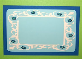
I spent more time sorting and moving things around the house today. I have moved some more shelves into my work area and reorganized some of my supplies. It took a while to move things around, but eventually I got a chance to take a break and try out an idea for a card.
One of my favorite things about the Design Studio software is the way you can take an image from a cartridge and make some adjustments to it to fit your particular project.
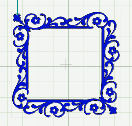
This lovely frame is on the Home Accents cartridge. It is designed as a nearly perfect square.
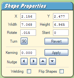
In the Shape Properties Box, you can see the width and height of the frame when I placed it on the mat and stretched it a bit with the lower right handle. I wanted to use this frame for a large card (an 8 1/2 x 11 piece of cardstock folded in half). In order to do this I needed to change the aspect ratio - the relationship of the height to the width - and turn the frame from a square into a rectangle.
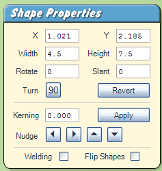
I knew that I wanted to layer the frame on my card with a contrasting piece of paper so I set the size at 4.5 inches x 7.5 inches. This changed the frame to the perfect size.

Here is a screen shot of the preview of the card design. To test out my design, I set up a rectangle in the card size (5.5 inches x 8.5 inches) on the third mat, a rectangle with rounded corners sized at 5 inches x 8 inches on the second mat and the frame on the first mat. I set preview colors similar to the ones I might use for the card.
I cut the frame and added it to my card. I didn't actually cut the card or the aqua layer with the Cricut. The base of the card is an 8 1/2 x 11 sheet of cardstock folded in half so no cutting was required. It was also more efficient to cut the 8 x 5 layer with my trimmer and round the corners than to use the Cricut to cut the layer. Everything fit together perfectly - I knew it would since I used the software to set up the card and preview the frame cut.
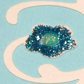
I wanted to add some sparkle to the design so I "stickled" the flowers. I used untraditional colors - turquoise for the flowers and eucalyptus for the centers - because I wanted to stay with a monochromatic scheme. I haven't decided yet what I will add to the center but the card is ready to customize for a special occasion. This card will work as either a horizontal or a vertical card so I have lots of options.
I didn't post a file for this cut - just follow the directions above to set up your own file if you want to try this idea for one of your cards. You can also choose another frame and set it up for a large card. It is interesting to see what happens with some of the designs - in some cases you may not want to choose a certain design once you see it altered! It is a great advantage to have the ability to preview your design with the software.

No comments:
Post a Comment
Thanks for taking the time to leave a comment. I love to hear from the people who read my blog. I moderate all comments to keep spam off the blog without making you decode the squiggly letters so your comment may not appear immediately.