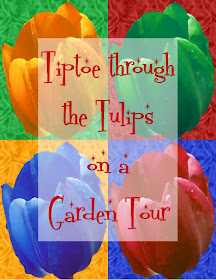
Yesterday was Thursday but I was caught up in a lot of projects and didn't have time to put together another Digital Challenge for FCTSC. So here is the Thursday Challenge on Friday!
For this challenge, I tried to use many different techniques to create a new piece of "art" from one of my photos.
I used my Creative Memories StoryBook Creator Plus software to do this challenge. I am sure that you can do many of these things with other programs but I find this software so simple to use - it allows me to be creative without getting bogged down in the process of figuring out how to do it!
I will explain all of the steps I went through to get from my photograph to the piece of "pop art" I made for a fictional Garden Tour invitation.
Remember, if you want to participate in the FCTSC digi challenge, you will need to join FCTSC in order to be able to post your project in the digital challenge section of the gallery.
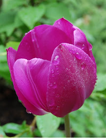
Here is the photo I started with - I took this photo in our back yard earlier this Spring.
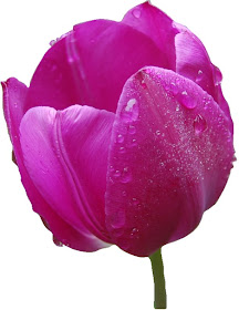
I used my digital cropping tools to eliminate all of the background, carefully trimming around the petals and the stem. I saved this image as a PNG file so I can use it for many projects.
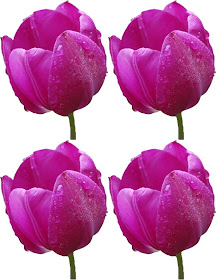
I resized the image to 4.25 inches wide by 5.5 inches tall and copied and pasted the image to put four copies on an 8 1/2 x 11 page.

I added color behind the tulip images - starting off with green.
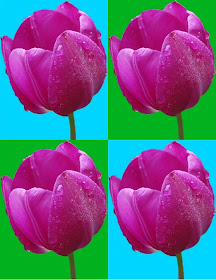
Then I alternated colors in each quadrant adding two aqua rectangles. Once I had this basic framework - a sort of Andy Warhol look - I could really start to have some fun with color and textures.
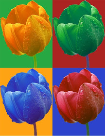
I used the "hue" slider bar and other options under the "enhance" tab to change the colors of the four tulips. I also placed the background colors in the quadrants using the color of the tulip from one section for the background of the next section, working in a counterclockwise direction.
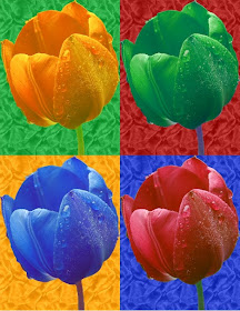
Once I had changed all the colors, I added some texture to the background rectangles.
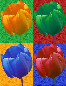
I then applied the "oil painting" effect to the entire page (you may be able to see this more clearly if you click on the picture above to enlarge it).
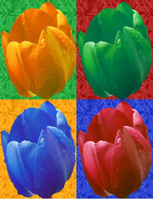
I decided I didn't like the way the stems looked so I unlocked the aspect ratio and stretched the tulip images to fill each quadrant.

I started to experiment with adding my "Garden Tour" invitation language by adding text in a white rectangle centered on the page with the opacity reduced to 50%.

I also experimented with adding "Gaussian Noise" to the page (this gives a grainy effect).
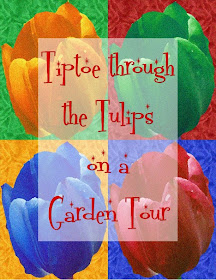
Here is the "invitation" over the "noised" version of the page.
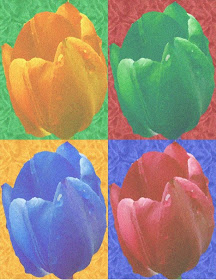
Finally, I reduced the opacity of the entire page for a softer image.
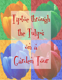
Here is the third version of the "invitation" with the softened effect of reduced opacity on both the background and the invitation language.

I decided that I like this version of the image best.
The font I used here is called "Fontdinerdotcom Sparkly" - I got it from dafont.com - here is a LINK to the font.
So have some fun trying out lots of different effects and post your creation on the FCTSC site when you get it done. If you have any questions or want more specifics about how I did this, don't hesitate to email me or leave a comment on this post with your contact information.

No comments:
Post a Comment
Thanks for taking the time to leave a comment. I love to hear from the people who read my blog. I moderate all comments to keep spam off the blog without making you decode the squiggly letters so your comment may not appear immediately.