Sunday, May 31, 2009

75th Birthday Card


We had a family get together today for my father-in-law's Birthday (he will be 75 in a few days). Of course, this called for a card! I wanted to try out the foil cardstock from my DCWV Citrus paper stack so I set about designing a card to feature the shiny mirror finish paper. I decided to use the blue (the stack comes with blue and red foil papers).
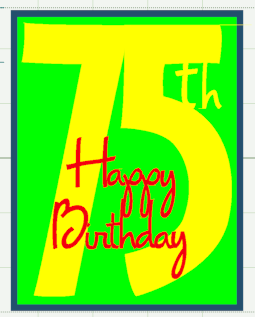


I wanted the card to have a more "masculine" look so I chose the "Opposites Attract" cartridge. This cartridge has both a bold blocky font and two variations of a cursive font. I used the "Opposite" font for the "75" and the "Upright" cursive font for the "th" I welded to the number and the "Happy Birthday" which I welded as a separate unit to place on top of the "75." If you position all of the letters in the manner you want them to weld, but leave weld unchecked, you can try previewing different colors for each page to see the effect of various colors for contrast.
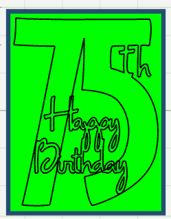


Once you have chosen your colors, be sure to go back and check "weld" so your letters and numbers will cut as one unit. You can double check this by previewing - if the shapes show up as a dark black line with no color inside they are welded.

The green and blue in the above screen shot are sizing rectangles - the blue represents an A2 card front (4.25 inches wide and 5.5 inches high) and the green is 4 inches wide and 5.25 inches high to represent a layer option with a one eighth inch border. When I did my test cuts, I actually cut the smaller rectangle so I would have a useful negative cut I could layer on the card top if I liked the look.


Here are two versions of the card. I used the blue foil and the bright green and orange cardstock from the Citrus cardstock stack and some glitter stripe cardstock from the Citrus stack to try various options for the card. The foil cardstock is very attractive - the shine is dramatic (and difficult to photograph!).


For this card, I inked the edges of the card, orange layer and "75th" with blue ink. The foil "Happy Birthday" looks great with the glitter cardstock.


This is the version of the card we decided to give - the shiny "75th" is the focal point with the "Happy Birthday" in orange layered on top.


Here is a close view of the "Happy Birthday" - I added white dots to give it a bit more "spark."


Yet another variation could be made using the offcut from the "75th" cut - you'd need to be sure to save the small piece between the "5" and the "t" and to adhere it in the correct position.

It is a lot of fun to experiment with various combinations of papers in the same design and to see the difference it can make for your cards.

Saturday, May 30, 2009

Home Accents Large Medallion


The addition of the "Hide Selected Contour" feature to the Design Studio software opened up many appealing design possibilities. I used the hide contour feature to create this medallion which could be used for a title page or to mat a special photo. This cut could not be made without the hide contour feature.


Above is a screen shot of the element as it appears when selected from the keypad at about 10 inches tall. The width is approximately 11 inches.


I resized the element to be 11 inches wide and 11 inches tall and rotated it 90 degrees to place the flowering arms at the top and bottom of the page.


This screen shot shows the shadow cut of the element as it is designed on the cartridge.


Above, you can see how this shadow looks behind the original cut, in a preview of the cut.


This screen shot shows all of the center contours hidden to create a large central area in the shape with the delicate outer sections still set to cut in full detail.


By hiding the center portions of the cut (they appear in pale blue in this screen shot), I created a different medallion image with the large central area for a title or a photo.


This screen shot shows the blackout version of the cut - the center is not solid but has a solid shape behind each section of the design.

Since the shadow cut and the blackout cut available on the cartridge did not give the effect I wanted for this page, I used the "Hide Selected Contour" option to produce the cut.

***Remember, to hide a cutting line, you left click exactly on a line of the design to select the line you want to hide - it will turn into a red dotted line. Then you right click and choose "Hide Selected Contour" from the bottom of the pop up menu - the line will turn pale blue to indicate that it will not be cut.

I made several test cuts and have added some photos below.

My first test was done on paper that is an orange shade on one side and a design that looks like damask wallpaper in yellow orange and green on the other side.


Above and below you can see the offcut from each side of the paper placed on a brown background paper.


The strong contrast makes the medallion shape very distinctive.


Here is the actual cut medallion layered on pale multi colored wash paper - the look of the cut medallion or the offcut sheet layered on a backing sheet is nearly the same.


It is important to choose papers with a good contrast between the shade and intensity of the color and background. Very busy patterns in nearly the same color value should be avoided since they easily confuse the eye and make the design very difficult to see and appreciate.


The second test cut was done on paper that has a busy daisy pattern on one side and a subtle pattern in a bright pink on the opposite side.


I think the pink and pale green work well together.


Above and below are photos of the the offcuts layered on contrasting papers


The busy pattern makes the design harder to see.

This design is one of many that you can create easily by using the "Hide Selected Contour" feature. I used this same shape with the contours hidden for another project that I will share very soon.

It is fun to play around with the hide selected contour feature - all sorts of interesting patterns can be created. I'd love to see some of your creations using this designing tool.

Friday, May 29, 2009

Life is a Beach card


We all have been waiting for a Design Studio update to add the latest cartridges to be released. I have heard that it will be here "soon" but it is hard to wait! I decided to use the Design Studio I have now to try to do something different with one of the Life is a Beach cuts.


Life is a Beach has two great card options. One is a photo card and one is a square card. For this little project, I used the square card, cut at five inches. As you can see above, the basic cut makes a very nice card - I particularly like the details in this cut - here is a closer view.


I decided to "dress it up" a bit by making a frame using elements from the Dreams Come True cartridge (there are some seaside items for Ariel - the little mermaid).


Here is a screen shot showing how I hid some contours to make a frame from the wave cuts on Dreams Come True. The waves are in a set of three but I only wanted one wavy line for the frame.


This screen shot shows the location of the waves I used on the virtual keypad.


This is the frame I designed and cut along with the extra layers for the shells - I cut the shells in pink glitter card stock.


I like the bold graphic look of the simple aqua and white card with the frame added.


Here is a closer view of the card once I added the sparkly shell layers.


The inside of the card has a 3.5 inch square of white cardstock backing the aperture cut. You could add a matching square on the right side.


If you cut a few extra shells, they could be used for decoration inside the card.


So, until the update is issued and we can use the newer cartridges for designing, why not try to do some Design Studio embellishing of the cuts from the new cartridges. It is fun to imagine the possibilities, and there will be so many more options once the cartridges are added to the program!


If you download the file, please pay attention to the instructions on the tabs to help with paper size and placement. There is a sizing frame on the first page that I used as a guideline for creating the file - I left it in the file so you could see how I planned this cut to fit the card. If you check the "this project" it will say that Dreams Come True and George were used - this is correct but you will not need George to cut the file.

Frame for five inch LAB chair card

Thursday, May 28, 2009

Digital Challenge #6 - Make your own element


It's Thursday again, so here is the digital challenge for FCTSC this week.

I have been experimenting with creating my own elements using the Creative Memories StoryBook Creator Plus program (you can click the link to find out more about this program). You can try to do this using whatever program you work with - some may have more basic elements and effects than others. I will explain what I did using the CM program.

The CM program has an assortment of shapes available to work with - some are the same as actual punches that CM sells for traditional scrapbooking and some are only available in the software. You can combine these various shapes to create new objects (just as you can design new shapes in the Cricut Design Studio program).


I started with this flower shape. I created the shape and filled it with a gradient of two shades of purple. I copied and pasted it and then rotated the second flower shape to overlap the first one and fill the gaps between petals. I applied a heavy shadow to the shapes and then grouped the two together.


Next, I added this shape on top of the two grouped flowers. I filled it with a dark pink. Finally, I added a circle for the center, filled it with a dark pink and peach gradient radiating from the center and applied a heavy shadow to each layer.


Once I had the additional shapes placed, I grouped the entire unit and started to try different textures and effects. I used the "rough" texture to add some interest.


Finally, I applied the "oil painting" effect to the flower - this closer view may help you see the effect more clearly...


This was fun to do and I'd love to create an entire garden of "new" flowers using these techniques. Maybe I will have time to do that...eventually.


Remember, if you want to participate in the FCTSC digi challenge, you will need to join FCTSC in order to be able to post your project in the digital challenge section of the gallery.


(Our house is quiet again - both sons are in New York. I drove them into Boston to catch the bus this afternoon. I miss them already, but I will have a bit more time for working on projects and teaching classes - between doctor appointments...

***Here is another hint about the exciting thing that happened yesterday - I am waiting for a mystery package to arrive - I hope it gets here soon so I can share what is inside with you!)
.

Wednesday, May 27, 2009

Vintage Recipe Book


We have had our oldest son and his girlfriend here for a visit this week - the time has flown by and they are heading for New York tomorrow and then back to San Francisco on Sunday. Our younger son is also leaving tomorrow to start his concert tour so our house will go from very busy to very quiet!

Everyone in our family loves to go to used bookstores to look for interesting treasures and, while they were exploring the town, they found this great salad recipe book from 1958 in one of the shops in Concord. When I looked at the cover and saw the font used I immediately thought of the George font and I had to open up Design Studio to compare the two.


Here is the word "salads" previewed in George. The two do not match but the extra stroke on the top of the "A" is somewhat similar and they have the same overall "look." I suppose it is just a funny coincidence - a bit of serendipity.


I love the 50's style of the cover design and I actually scanned the illustrations and poems inside. I thought I'd share a few with you.


This poem for the "G" recipes is particularly appropriate since our son's girlfriend is from the city of Gilroy in California - "The Garlic Capitol of the World." Here is a LINK to the website about the Garlic Festival which is held there in July each year. It sounds like a lot of fun.


June is nearly here - so it is time for salad! It really isn't very hot here yet - today was chilly and damp but the weather should get warm soon.


I enjoyed this "musical" rhyme! I am sure I will find a way to incorporate some things from this book in future projects.


Here is a photo of our family after our farewell dinner tonight - the restaurant owner took this photo for us (oldest son and his girlfriend on the left, youngest son and his girlfriend on the right and a high school friend of oldest son who joined us for dinner is in the middle).

Once I get the travelers delivered to the station for the trip to New York, I will have some quiet time tomorrow to test cut some of the designs that are waiting in my Projects folder. I also had a very unexpected and exciting email arrive today and there will be a lot of surprises coming to my blog soon!