Pages
▼
Tuesday, March 31, 2009
Something new for me....
Back in January, I signed up for a sketch swap in a group on the Cricut.com message board. I had not heard whether it was actually happening due to some health and family issues for the organizer, but apparently we are going forward.
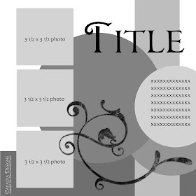
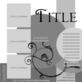
So tonight, I did my first "sketch" for a 12 x 12 layout. I usually just do my layouts by sitting down and creating something that "looks good to me" so this was a new approach. I have never created a sketch using the computer, but, once again, my Creative Memories StoryBook software made it fairly easy to do.
I used shapes and shades of gray for the layout and added a swirl from one of the digital overlays I have purchased by download. I did two versions - one with the basic shapes and placement and the second with the actual dimensions added right on the sketch page. This makes it easier to duplicate in actual paper as opposed to using it for a digital layout.
Then I found a few spring photos and actually used my sketch to do a digital page. If you want to give this sketch a try I'd love to see what you do with it!
April 1st, 12:23 p.m. -ETA - I started this post in the evening yesterday but posted it late last night and I did not realize that I had changed the layers in my layout from the sketch. I think that is what sketches are for - to inspire but not necessarily follow exactly, however, I actually meant to make this the same as my sketch (!) - I have corrected the page but I am leaving the "alternate version" here - which do you prefer? Alternate is above and original below...
Monday, March 30, 2009
Full Page Tiny Scallop
I wanted to make a full page for a layout with a very small scallop on the edge. I have done lots of scalloped shapes using many individual circles aligned around a shape. This time I made the file using a quick and easy method.
Earlier this month I explained how to make a scalloped rectangle using scalloped squares ( here is a LINK to that post). The same method works for combining many small scalloped squares to make a full page with small scallops.
For this file I used a scalloped square from the Storybook cartridge which is highlighted in the screen shot above. If you don't have Storybook, you can use a scalloped square from another cartridge.
I created a row of welded scalloped squares and copied and pasted it to fill the page. I tweaked the sizes a bit to make the design fit the page, filling the "cuttable" area as fully as possible while maintaining the square shape.
Above you can see a close view of the overlapping squares. The scallop at the corner of each square is slightly shallower. If I had nudged the square over two "bumps" the scallops would be exactly the same depth.
Above you can see the squares overlapped by two in the preview screen.
This screen shot of the preview on the blank preview page, clearly shows the slight difference between the double overlap and the single corner overlap.
In the photo above, you can see the cut from the file with the scalloped edge made with just one overlap. The difference in the one scallop is noticeable but I decided that it was not noticeable enough to go back and change the file (I guess I was in a hurry!). Just think of it as a "design choice" to add a bit of interest...
Here is the full page with the tiny scalloped edge. Due to the limitations of the "cuttable"area of the mat, the cut leaves a narrow border when layered on a sheet of 12 x 12 paper.
Above is one more close view of this edge. By using this method you can make a scalloped page with scallops in your preferred size quickly and easily.
Full Page Square with Tiny Scallop
Sunday, March 29, 2009
Scallop Half Circle Card
In February, I shared a file for a large circle (nearly a full 12 x 12 page) with small scallops. Here is a LINK to that post with more explanation about the design and the file download link. The file uses Plantin Schoolbook since it must be cut on the Expression.
If you cut that file, cut the circle in half, then score and fold the half circle in half again, you can make an interesting shaped card.
My test cut of the scalloped circle was in a lilac. I thought it looked a bit "Springy" and used it to make the card. I cut some strips of dots from a DCWV glitter mat stack from last summer and rounded the ends to fit the scallops. Then I added three flowers with "gem" centers in colors to coordinate with the dotted strips.
I haven't added a sentiment yet - I am not sure what I will use the card for. This is an oversize card and will fit in a square envelope for a 6 x 6 card (remember, if you mail this in the US it does need extra postage). Of course, you can always hand deliver it.
Above is one more photo looking down into the card. What is it about scallops that just seems to make people happy?
(I wanted to share the filigree card topper file tonight, but I am having an issue with some of the test cuts. I think the problem is between Design Studio and my baby bug, but I want to be sure before I share the file. I also managed to misplace the cuts I made to photograph - I was finishing some swaps and I think they got lost in the shuffle. Tomorrow I will be clearing things up in my scraproom - I have illusions that order will be restored (!) So the filigree file will be here soon....)
Saturday, March 28, 2009
Family Time
As I mentioned, this weekend we have been busy doing family things. On Friday night, my niece's singing group had a "Pops" coffeehouse concert performing songs from movies. They did a great job - there are lots of talented singers in the group.
Today we helped my husband's parents do some clearing out at their house, in preparation for the annual rummage sale (known in the family as "La Ramahge") at their church. Some of the items were for the dump, some will go to recycling or the sale and a few came home with us (!)
We worked in the garage for a while and then did some sorting in the den. While we were going through one box, I found this photo of my husband and his five siblings. I brought it home to scan (despite much encouragement from the younger generations, Grandma and Grandpa do not own or want a computer). I didn't remember this particular photo and I really liked it. My husband is the oldest, followed by three sisters and then two brothers.
When we got home, I was too tired to go downstairs and work with the Cricut, so I sat with my laptop and did a quick digital layout with the photo. I used my Creative Memories StoryBook Plus software - this is a great program which is very easy to use. This was a quick and simple 8 x 8 layout, but I did a few things that are interesting.
By using the "hue" control in the "Enhance" tab, I was able to change this brown piece of background paper to a nice shade of blue. Our entire family has a tendency to wear blue. When we were together for a family trip and had a professional photo taken, the photographer commented on our "color coordination" in the choice of clothing. We actually had not planned anything special, everyone was just wearing their favorite clothes - which were nearly all blue!
I cropped the photo into an oval, matted it, softened the edge of the photo, put a shadow on the photo and the mat, added a swirl flourish in the corner, applied a woven texture to the swirl, added a ribbon and a label with the year, added a quote for a title and shadowed everything. One of my favorite things about digital scrapping is the ability to "audition" different colors and papers with a click of the mouse - no wasted paper! I probably will change this layout a few more times before I finally decide it is finished and ready to print.
The photo I scanned was printed on a textured paper and the scanner picks up the pattern resulting in a slightly striped effect. There was also some "noise" in the scan. To minimize and soften the impact on the photo, I applied an oil painting effect to the photo.
Here is the photo after I applied the oil painting effect - I am not sure it it shows clearly but you can click on each of these photos to enlarge them and see the difference.
Tomorrow it is supposed to rain and I hope to spend a big part of the day working in my scraproom (between loads of laundry). I should be able to get to the filigree file and get it ready for sharing either tomorrow or Monday. I hope you didn't mind this little detour into a different type of designing that I enjoy. If you have any questions about digital scrapping please let me know and I will try to help.
Friday, March 27, 2009
Filigree Border Card Topper
Here is another variation of the filigree designs I have been creating. This time I chose a very muted color scheme and made a full A2 card topper by creating the border at the top and bottom. I used the same element that I used for the"Thank You" card yesterday, but the pattern that results is slightly different.
The words were cut using the die from Cuttlebug "Love Language" A2 combo set. I saved the tiny dot for the "i," but then I decided that just a bit of bling would be a good addition to the card, so I dotted the "i" with a little gem.
For those who are anxious for the download, please be patient - I am still refining and testing this file. There are a few other projects that I need to finish and we have a lot of family events this weekend.
Thursday, March 26, 2009
Filigree Border
I have been experimenting with some filigree designs. The Storybook cartridge with all the lacy motifs and frames is one of my favorites and I decided to try to make some of my own using a variety of older cartridges.
This is the test cut of one of the borders I am working on. I thought it was pretty so I decided to put together a card using some bright Spring colors.
The pink polka dot ribbon is by American Crafts. I used DCWV glitter cardstock for the "thanks" and cut it with the Cuttlebug die from the "With Gratitude"A2 combo set. The textured green cardstock is also DCWV and the card base is Bazzill Basics.
I thought the card looked a bit plain, so I added a couple of Prima flowers. They are held together with a pink shimmer brad and adhered to the card with a large foam square for a bit of dimension.
Here is another view of the filigree edge. I am putting together a file with variations in various card sizes and page borders. I probably won't finish it for a few days, due to other projects that I need to get in the mail.
These are fun to do - there are so many different ways to create new borders, the only limit is your imagination!
Wednesday, March 25, 2009
Lacy Lattice "Spirograph" medallion - some more variations
It took a lot of guesses from a lot of readers, but finally Patty D. (congrats Patty!) got the answer - this design was created using the frame for a label from the Calligraphy Collection cartridge.
Above you can see the screen shot of the keypad showing the frame I used (highlighted in green).
Some people guessed Plantin Schoolbook - there is an "atomic" shape with eight points on that cartridge, but it has some extra circles orbiting around the center which can't be eliminated easily since they are part of the continuous line of the design.
Lots of people guessed Fabulous Finds or Wild Card - these cartridges both have a similar shape but, in each case the shape is much thicker. The unique feature of the Calligraphy Collection frame is that it is very thin so the resulting design is much more intricate.
Many of us think of the Spirograph toy when looking at this design - I didn't have a chance to try it with markers yet but I did do some variations to the first file and test cut these to show you some of the interesting combinations (and no....I still didn't get my card made!).
If you are curious about the math behind this type of design, here is a LINK to the Wikipedia entry about the Spirograph. If you want to have some fun experimenting with these designs on your computer screen check out this LINK to the an article by David Little of the Penn State Math Department - there is a pattern generator that is fun to try!
I made several more variations - using 8 or 16 points and sometimes using "hide selected contour" to fill in the circles at the tips. If you hide the circles on opposite tips of the same frame, they will stay hidden when you reopen the file (and your design will be symmetrical).
I have been asked what settings I used to cut these. I was using my baby bug, with the blade depth at 6, pressure at 4 and medium speed (though I don't think the speed control on the machine actually has an effect when you cut with Design Studio). This cut cleanly through heavy "no name" cardstock as well as Bazzill slightly textured cardstock. I would not try to cut this design from thin patterned paper - you need some "body" in the paper.
If you are careful as you remove the 8 point version you can save the offcuts for another variation. Above you can see them on the cutting mat after I lifted the lace cut. You could reassemble these in this pattern on your card or page.
You could also just use the center bits to make a star. This one reminds me of a quilt pattern.
If you have lots of patience (more than I have!) you could even try to save the bits from the 16 point version. As you can see in the photos above and below some tend to stay with the cut and some on the mat and the pieces are extremely tiny.
When you are lifting the cut, it is helpful to bend the mat back a bit and you should go slowly to avoid tearing any of the thin lines.
If you do tear one, you will probably be able to glue it down so the tear won't show on your finished project.
By using the various frames and layering the offcuts you can get all sorts of interesting patterns and designs - here are a group of photos of some that I layered as examples (nothing is adhered so they are not all flat.
I actually like the effect that comes from some of the slightly curved cuts - I just need to figure out how to hold everything together.
And now for a bit of photo overload!
Below you can see the offcuts which mimic the solid shapes - by layering these you get the effect of a second shape.
Above is the sixteen point shape and below is the eight point shape.
You can even stack two offcuts to get some interesting effects.
So many variations.... below is a solid shape on top of one of the offcuts.
As I promised yesterday, I edited yesterday's post this afternoon to add the basic file (here is a LINK to that post). Tonight I have added another file with the variations - obviously you can take this even further as you experiment with colors and patterns.
(and I will get that card done soon!)
Lacy Lattice Flower (variations)