Saturday, February 28, 2009
What is in the Box?
It's been a very busy day. I finished a project but I am on my way to see the High School play and so I am posting a little "teaser." I may get to write this all up when I get home, otherwise, check back tomorrow!
Here is one more clue....what do you think?
Friday, February 27, 2009
Cards with Gate Fold Pop-Ups
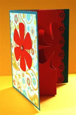
In the demonstration videos I have seen for a product called "The Ultimate Crafter's Companion," there is an interesting card which is formed by inserting a gate fold card with a reverse center fold inside a regular card (hard to say it in words but easy to understand if you look at the photos!).
To cut a shape opening in the insert, the demonstrator uses the board to score a shape and then hand trims around the score line. I have tried this tool and I found it a bit difficult to get the score lines for the shape in the correct place - when I tried the butterfly - I ended up with two sizes combined in one!
I went ahead and assembled the card with the oddly shaped butterfly and added a few personal touches. I put some lining paper behind the opening, punched the sides of the insert with a border punch and set the insert back into the card a bit from the edges to show off the borders. You can see the unembellished card center in the photo above.
I was thinking about the difficulty with scoring & hand cutting and also about the limited number of designs available on the tool. It occurred to me that with the Cricut and my Scor-Pal I could easily make interesting cards with many shapes to choose from for the center cut-out.
You need to choose a simple shape that works as a silhouette since there will be no interior details to define the shape. To cut the shape in the proper position for an A2 card, you can set up your mat in Design Studio with a rectangle that is 5.5 inches tall and 8.5 inches wide. Then add additional rectangles to help you center your image, one at 2.125 inches wide, one at 4.25 inches wide and one at 6.375 inches all aligned at the left side as you can see in the screen shot below.
By using these guidelines, you can choose the appropriate size and placement for the shape you will cut for the pop up. In this simple example, I chose a flower from Plantin Schoolbook. Delete all but the largest rectangle when you are ready to cut the insert.
After cutting the insert, you can use the special score lines for a gatefold of an A2 card that are found on the Scor-Pal - they are marked by a small dot just beyond the 2 inch and before the 6 1/2 inch lines. If you don't have a Scor-Pal, you need to score at 2.125 inches (2 1/8), 4.25 inches (4 1/4) and 6.375 inches (6 3/8).
You score the 2 1/8 and 6 3/8 lines on the back of the paper (just flip it over) and the center line on the front - remember, you should fold toward the "mountain" not the "valley" so you just have to think for a minute to get the folds right. (Don't worry, if you fold it in the wrong direction you can refold it so the end result looks like the photo above!).
To add some interest, I used a border punch on the outside edges of the insert - in this case a flower border that is similar to the center cut-out.
I also cut a 2 x 5 1/2 inch piece of patterned paper to adhere to the center of the card (folded right sides together and then adhered it in the folded card.
Then I adhered the insert to the card, setting it back a bit from the edges to show off the pretty punched border. I used the edge of the patterned paper liner as a guideline for adhering first one side and then the other side of the insert.
Above is a view from the top of the card to show the construction more clearly.
Here is one more photo so you can see how it all fits together.
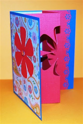
When the card is closed the insert collapses along the fold line.
I cut a piece of the same patterned paper for the front - cut at 4 x 5 1/4 inches and centered. I used the cut out flower from the insert as a decoration on the front of the card with a gem for the center of the flower. The card is now ready for a sentiment and some additional embellishing. If you want to ink the edges or stamp or use Stickles on the insert it will be easier to add these to the flat insert before you assemble the card.
There is no file to share today - just follow the directions above and you can make a card with a pop up insert and a cut-out in any shape you would like!
Thursday, February 26, 2009
Postage Stamp Backgrounds (two sizes)
I was looking through some magazines and saw a background paper that was interesting. It wasn't a scallop (for a change!) - it had more of a postage stamp look at the edges. I decided to create a Design Studio file to cut something similar - this is one of those "utility files" that will be useful for many pages.
I did a file for a full page in both George and Plantin Schoolbook - obviously, you will need the Expression to cut these (I have found that some people who already had a baby bug and upgraded to the Expression chose different cartridges when they purchased their big bug so they need a George file). Since I needed to test cut two files I did them in opposite colors - I think this makes a nice double page spread.
I also did files for half page cuts and tested those. I tested the George file on the baby bug. I had all sorts of trauma with the baby bug tonight. I was using DCWV textured cardstock for the test cuts and I accidentally put this piece on the mat with the more textured side facing down - it did not stay stuck down! The angry little bug really slashed up this paper. I should know better than to use this paper for test cuts. I don't care for it very much for Cricut cuts, particularly since it has a white core which sometimes ends up showing. (I am sharing my bad cut in the hopes that you can learn from my experience!)
The next test cut (with a new mat and with the paper smooth side down) went fine - up to 94% when my baby bug mysteriously refused to finish the cut! It is so frustrating when this happens and there is no rhyme or reason to these occasional refusals to finish - such temperamental machines! In my experience, if this happens you have to close the program and reopen it to get the software to start responding again.
Not to be defeated, I thought of an interesting use for this botched cut (I actually had considered this alternative as I made the file).
You can weave ribbons through the evenly spaced holes - above you can see a couple of examples. If you want to use this file for ribbon weaving you can simply delete the center square so the Cricut will cut only the circles (with a little luck the file will cut completely). Add back the square (or rectangle on the half sheet cuts) to get the postage stamp cut.
You can position the half sheet cuts horizontally,
vertically or even...
at an angle on a 12 x 12 piece of cardstock - each makes an interesting background for a layout.
If you save the offcuts, you can use them for additional decoration - offsetting them with the background cut to create a rope border effect.'
I made the files as large as I could - you will notice that the Plantin Schoolbook file will not cut the outer edge of the circles on one side but the edges of the postage stamp cut will be complete.
Full Page Postage Stamp Background - George
Full Page Postage Stamp Background - Plantin Schoolbook
Half Page Postage Stamp Background - George
Half Page Postage Stamp Background - Plantin Schoolbook
Wednesday, February 25, 2009
Another Baby Name Frame
Tonight I am sharing another baby name frame. This one is an 8 x 20 inch frame and for the background I used the art paper I wrote about in the "Card Economics" post (here is a LINK in case you missed that post). This is a lovely heavy paper and I could cut a piece to exactly the right size for the frame with no seam in the background.
This little boy has a rather unusual name with five letters - ideal for large letters that center nicely in the space. I used the Mickey Font cartridge because it is nice and chunky with a playful "feel."
I cut the letters in a bright nautical blue on "shadow" and then cut the letters in regular size in some patterned paper that has a watery feel. I added three dots to each letter to give them a bit of "punch."
I used foam squares to lift the letters slightly for a shadow effect.
The name is framed with lines and dots with waves along the bottom border. The waves are from the "Going Places" cartridge - I welded together as many as would fit on a 12 inch paper and then adhered two sets of waves together to make them fit the width of the frame.
In the gaps between the lines that frame the design I hand wrote the birth date and time and the "statistics" of birth weight and height.
The parents of this boy serve in the Navy, so I added a few boats for a "nautical" touch. His full name is written on the three boats (I blurred out the surname on the third boat for this post). I used a blue pen to highlight the cuts for the mast.
Of course I had to make a matching card to go with the gift. I used a few of the scraps with words that I cut from the Cuttlebug "Welcome Baby" A2 combination cut and emboss set.
You may remember the Abigail name frame (here is a LINK to that entry if you missed it). Here are the two frames together - they are not for siblings, I just happened to do them around the same time and like the way the two look together(!).
I spent most of the day working on revising the directions for one of my designs for publication - very exciting but time consuming! I have several other interesting projects in the works but haven't had time to do the photos and directions to post here yet - new .cut files will be here soon...in the meanwhile - here is another "sneak peek"
Labels:
C - Going Places,
C - Mickey Font,
P - Card,
P - Frame
Tuesday, February 24, 2009
Remember the Chipboard Albums.....?
I imagine you all think I forgot about my promise to share an interesting way to decorate the chipboard flower albums after they are papered. I didn't really forget, but there were other things that kept popping up that pushed that information aside. (If you missed the post about the Chipboard albums, here is a LINK).
So, at last, here is the interesting thing I noticed. I try to be neat when I am crafting, but I get so involved in making things that I don't always tidy up after each project. Usually there are lots of random bits sitting on my table from previous projects - right now there are a lot of the medallions that I have been making and sharing. (to find the posts for these check the "cartridges used - topics" in the side column - click medallions for all of the medallion posts and links to the files).
If you think about the way I designed those medallions, you will see where this is going (!). The chipboard flower albums have eight "petals" and the medallions are eight sided designs as well. This means that they will work very nicely on the Chipboard flower pages.
Here are a few examples:
When you cut the medallions be sure to save all of the offcuts - these are also useful for making some very dramatic and beautiful patterns.
I noticed that this butterfly paper has a butterfly very similar to the Martha Stewart "monarch butterfly" punch - you can see a punched sample in the center below.
I am just fascinated by all of these medallions and the effects that can be obtained by combining them and by using the offcuts creatively. Here are a few more examples - the possibilities are limitless!
You may need to adjust the sizes from my original designs to get exactly the effect you are looking for - just change the original element to the desired size, check weld and then copy and paste it three times changing the rotation to 45, 90 and -45 degrees.
I'll show you another chipboard album soon - and I'd love to see any that you have covered using my flower file.
Subscribe to:
Posts (Atom)