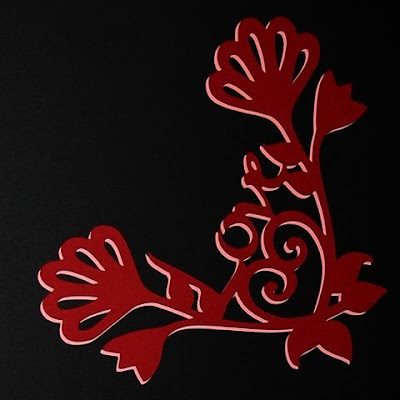
Here is the little design you saw sitting on the scalloped square page in my post a couple of days ago (here is a LINK to that post).

I made this a long time ago and discovered it as I was trying to "clean up" my folders of .cut files. I have a habit of doing a "save as" at various stages as I design something complicated in case the file suddenly corrupts (so I don't lose all my work) and, once the files are completed, I should be deleting these backup files. However, I usually get interested in the next project or idea and end up just leave them all sitting around - so every so often I spend some time reorganizing the "projects" folder and find little things that have been overlooked!

I designed this as a corner ornament for a scrapbook page - I did a few test cuts in both red and pink which you can see in the photos above and below. It is interesting to see how various color combinations can give a very different "feel" to the design.

I haven't used my Cricut markers for ages so I decided to get them out and use the red to outline this cut on pink. I usually do the cut first and then, without removing the mat from the machine, take out the blade housing, put in the marker and repeat the cut. If you use the marker first, be sure to let the ink dry a bit before you cut so the paper does not tear.
Below you can see the design on the mat after cutting and drawing with the marker.

You can actually use the markers to simply draw on your paper and skip the cutting - this creates interesting custom papers for your layouts or cards. I this case, I positioned the design in the upper portion of the mat so it could be cut with the baby bug and I would need to move it lower on the page to use it as a corner drawing.

Above you can see the cut after it was removed from the mat - it will fit on a 5 x 7 card if you tilt it into a "V" shape. The markers add a nice outline around the entire design, giving it better definition and a bit of dimension. Below you can see the comparison between a plain cut and a cut with the markers used as a second step.

Designs like this can be difficult to shadow in Design Studio if each element does not have a shadow option on the cartridge. One way to get around this is with a "faux" shadow. Cut the design twice in two different colors and then layer the two cuts, offsetting them a bit. The shadow this produces is not an outline shadow but more like the shadow from a light source and can be quite effective as you can see in the photo below.

I haven't actually finished the cards or layout but have simply taken photos so you can see the relative size of the cuts. I'd love to see a finished project you make using this design.
Love Corner Flourish

Absolutely beautiful...I love the markers...it adds dimension. And the idea of the offset shadow is great too...you think of everything Diane. Thanks so much...my imagination is working overtime now!! I am inspired. :) TFS
ReplyDeleteDiane, that is just beautiful. Love your work
ReplyDeleteThank you Diane! And you used the carts I have!
ReplyDeleteCarmen
I love it...TFS!
ReplyDeletecyimbugbitten
I was looking at some of my carts that didn't have shadow features for the various shapes I wanted, wondering if ofsetting them would be enough. This is absolutely perfect, love this method.
ReplyDeleteTake care, have a nice trip taking your son to college.
--Gracie at EverythingCricut.blogspot.com
This is beautiful...I love the markers! Adding the markers after the cut seems like a good idea; I will try this! TFS!
ReplyDeleteWhat a beautiful design and I really like your shodowing fix. Thanks so much for sharing.
ReplyDeleteThis is just beautiful! Thank you for sharing! You do some beautiful work!
ReplyDelete