
I did another adjustable title design - these really are addictive! (The tutorial explaining how to create this type of design is linked at the top right corner of the page). If you choose your elements carefully, you can take advantage of the layering available on many of the Cricut cartridges.
I selected the ocean elements (waves, seahorse, starfish) from the Dreams Come True cartridge (they go with Ariel from the "The Little Mermaid") and also used the upright upper case font from Opposites Attract. The original design in a few sizes is on the first page of the file. After I created the full design, I used the shape properties box to create a border/title for a 12 x 12 page by setting the height at 3.5 inches and the width at 11.5 inches. This is set up on the second page of the file. The third page just shows the design stretched to cover most of the page - you can play around with it to get comfortable with using the "handles" (but remember to always keep at least one copy of the original design so you don't need to download it again)!
When I changed the settings to fit the design to the 12 x 12 page, the elements changed in their proportions. I needed to select the layer options for the seahorse and starfish and then place each one over the modified design and use the stretching handles (lower right for both directions, center left for horizontal stretch and center bottom for vertical stretch) to size the layers individually. Once I had them matching the base layer, I placed them in positions on the mat where I could use the "multiple colors of paper all cutting at once" method to get the cuts I needed for this design at the same time (this is the method I have explained in previous posts about making the Disney Princesses).
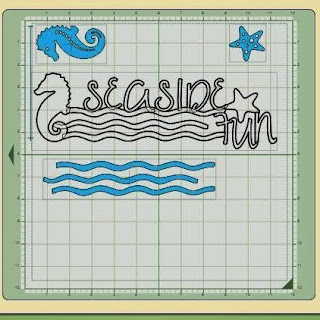
Above is a screen shot of the placement of the elements (the layers show in solid blue since they are not welded) and below you can see how the mat was set up and the results after cutting.
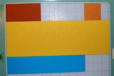
Below you can see all of the elements after they were removed from the mat (all placed on a 12 x 12 sheet of card stock so you can see the relative sizes).
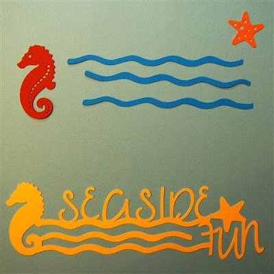

If you look carefully at the screen shot you can see that there is some overlap of the waves and the seahorse in the design. This area will need to be trimmed so the layers will work properly (and the blue wave will not show through the detail holes on the seahorse).
Below you can see the wave before and after trimming. In the photo I had the top and bottom waves reversed (be careful they are easy to confuse!) but when you try to adhere them you will realize which one belongs in each position. You can leave these untrimmed and just tuck them under the seahorse.
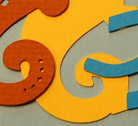
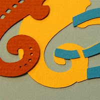
It is fine to put the adhesive on the waves base layer, but you should put the adhesive on the top layer for the starfish and seahorse to avoid any chance of glue showing through the detail holes.
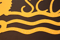
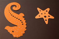
Below is the title with the layers added

You can also try offsetting the layers a bit for a different effect. I think this is particularly effective for the waves.

You will also have these offcuts which can be used for another project.
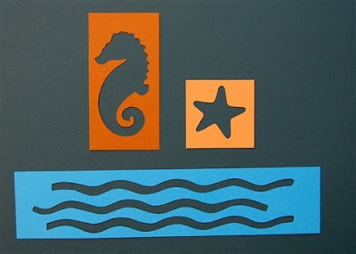
This should be useful for summer vacation pages - I hope some of you will have photos that work with this design. You could cut out additional seaside elements and placed them around the layout to tie things all together.
Seaside Fun (A)

wonderful design
ReplyDeleteDiane, this is really nice. My Dream Come True just arrived yesterday. One of the reasons I wanted this cart was for the plethora of sea cuts! Thanks for supplying my frist DCT cut file!!!
ReplyDeleteSusan
This title is great, you come up with great ideas. Thank you for sharing you cut files with everyone.
ReplyDeleteGloria
Diane, I just love your blog and I frequent it often. I have a question about the Design Studio and just wondered if you could help? I will also ask around on the Cricut MB. Is there a way to weld a shape with another to "hide" the cutouts, thus producing a blackout image?
ReplyDeleteHi Anna Dawn,
ReplyDeleteYou can't quite completely black out the cut holes in a shape but, if you weld another shape placed to cover nearly the entire area of the cutout holes you want to black out, you will end up with just a small dot or slit which should work in most cases. It can cover 99% of the hole but a tiny bit has to remain or else the entire original hole will be covered and the shape you welded on top will cut in full.
I hope that helps you with your project!
Thanks Diane. I came to that same conclusion, but just wanted to believe there was another way. As much as I LOVE this program, it still has a lot of tweaking they can do to make it more user friendly. Thanks for the help.
ReplyDeleteThis will be great for my beach pics. Thanks Diane for sharing the file.
ReplyDeleteRoxy