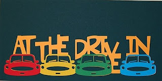
I enjoy looking through the cartridges in Design Studio and finding something to inspire me to make a design. On the new Graphically Speaking cartridge the bottom two feature keys show a car image. I looked at this and the idea of drive-in movies popped into my head. I am not sure if drive-ins are very common now, but I have fond memories of going to the drive-in as a child. Even though I don't have any photos of my family at a drive-in, I thought I could do an album page that features some childhood memories.
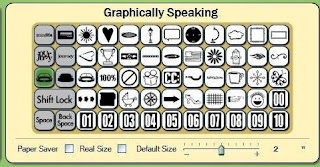
I built this design in the same way I did the "School Days" from a few days ago. This design is for a border and does not have a frame surrounding the words and images (check the tutorial pinned to the top right of my blog home page for step by step directions).
Once you have a design built this way you can alter it by using the handles around the design.

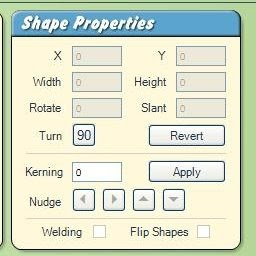
or by entering values in the Shape Properties Box
I thought I would show some examples since I have received some questions about the use of the handles and the shape properties box.
By paying attention to the grid lines on the mat you can easily stretch the design using the lower right handle to preserve the aspect ratio (the design will stretch proportionately by height and width). The two designs below were sized for a 12 x 12 and an 8 x 8 page layout.

If you use the center bottom handle, you can stretch the design vertically - it would look like this
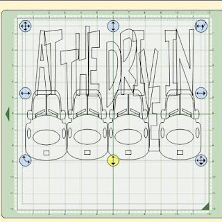
If you use the handle on the center right you can stretch the design horizontally and it would look like this (mat view switched to 12 x 24)
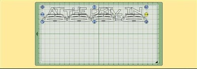
By using the handle in the upper right corner you can skew or tilt the image to the right

or to the left
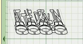
The lower left handle will rotate the design
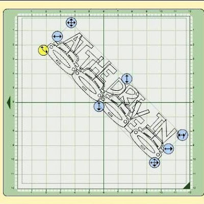
If you "lose" the placement handles which move the design in "any direction" (top left handle), "vertically only "(top center) or" horizontally only" (left center), remember that you can use the arrow keys on your computer keyboard to get the design back on the mat and into a position where you can work with it.
You can also move the design by entering values in the Shape Properties Box

This is particularly helpful if you know that you have a certain space on a scrapbook layout or a card front where you want to use the design. Just select your design, type the desired measurements in the width and height boxes and click anywhere on the mat for the values to be applied.
One IMPORTANT note - do not use the "Apply" button after you select the sizes you want - this is used only for kerning. If you look carefully, you will see a fine gray line separating the kerning area (which includes the nudging arrows) from the top part of the box.
If you hit the kerning "Apply" button when you simply want to alter your shape your design will "jump apart" and you will have to move the elements back into position (which can be tedious).
This is another reason to save frequently and to use the "save as" option to save into a different file every so often as you work with the design. You will then be able to go back to a partially completed version of the design if you forget and hit "apply kerning" at the wrong time or run into the "sticky nudge button" problem which I mentioned in a few previous posts. (Once that nudge button goes into overdrive there seems to be nothing you can do to save the file - any element you click on will "drift" in the lasted used nudge direction and the file seems to be permanently corrupted by this).
So back to this design....
Here you can see the full cut - this could be used in one color but I thought it would be fun to make the cars all different colors.
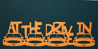
In order to do this, I had to "back them out" of the design by selecting the grouped image and hitting "Backspace" (NOT "delete") four times since the cars were the last four items I added to the design. This gives me a layer for the words only (which I did not use in the photographed example - I simply chose a base color that I wanted to use for the final design).

To cut the four cars I need to add them to the mat as individual images. If you have adapted your design to a certain size to fit your layout, you will not simply use the same object in the size you originally chose since it may no longer be a perfect fit.
You should select the same object and place it directly over the part of the welded design where that object appears - then, by using the handles on this separate element you can adapt it to be a perfect layer for your new design.
Here is a screen shot of the car which has been sized to be a perfect match and then moved off the design to be placed separately for cutting.
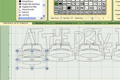
Make four of these by copying and pasting and then you can set up your mat for cutting everything at once.

The cuts on the mat after "weeding" the outer paper.

and the final base and layers
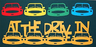
I wonder if any of my blog readers remember the drive-in movies - let me know if you do! (or if they still have them in your area...)
At The Drive In (A)

WooHoo, Diane! You have been hard at work...can't thank you enough for sharing all these fantastic hints, ideas and tutorials! I'm giddy with excitement to give everything a try...and I haven't even had time to download the updates yet!
ReplyDeleteDiane
ReplyDeleteYou are such a fantastic designer! Just saying thank you does not seem like enough for all that you do in sharing and teaching. You are such a sweetheart.
Laurel
This is so great! Very creative, love it!
ReplyDeleteYou are awesome! Sadly we don't have any drive-ins around my area anymore. I remember packing the kids in the car with their PJs and a tupperware bowl of popcorn. I loved them when I was young too, remember $1.00 a car load???
ReplyDeleteDiane that is a wonderful design!!
ReplyDeleteI am new to DS and this is a great tutorial!! I remember the drive-in from when I was a kid. The one in my area closed in the mid 80's but reopened in the early 90's and is still open now. Next time I go I will have to take my camera!!!
ReplyDeleteThis is so great! We still have one drive-in operating in my town and we try to go there once every summer!
ReplyDeleteI so miss the Drive-In. We have none in our area anymore. So sad to see these go.
ReplyDeleteI stumbled across your blog and have been checking out your designs - absolutely wonderful. I just got the big bug, so I am anxious to try some of these out.
ReplyDeleteI LOVE this drive in!! They are few and far between now - but maybe now is the time to seek them out and use this on a page!
Thanks for sharing your talent!
Thank you so much for designing this. We have three drive-ins around us and we love them. As a big family, it's cheaper to go vs a regular movie. Plus my littlest one went for the first time this summer, so I'll do a special page for him!! Thanks!!
ReplyDeleteCapadia, Love this, thanks for sharing. :)
ReplyDelete