Pages
▼
Friday, February 29, 2008
Heart and Ribbons Frame
The last couple of frames I have posted are rather large and meant for a special, large photo - here is a smaller one that could be used in multiples or on a card. Once again it could benefit from some "bling" like this...
Here is a photo with the Princess frame to give you an idea of the relative size -
I hope there is soon an update to the Design Studio software to let us "select all" and "group" and easily resize the things we create without having to start over from the beginning!
Heart and Bows Frame
Pretty Princess Frame
This is another variation on the anniversary frame - I cut this from plain pink but realized right away that it definitely can use some "bling." Once again - be sure to keep track of the small dot for the "i" or you can use my Cricut message board friend Kopperhead's suggestion and use a gem for the dot! (see the link to her "100 Things" blog in the right column).
Since I don't have a plan for a layout yet, I didn't attach these "gems" but this photo gives you an idea of how it could look - now I need to get some Stickles to outline the edges!
The view below shows how this looks on a full 12 x 12 sheet at an angle. When I figure out which photos I can use this with I will post an embellished version - or you can try this design and post your version back for me!
Pretty Princess Frame
Thursday, February 28, 2008
Fancy Anniversary Frame
I have been playing around with lots of ways to frame and mat photos - some simple, some not so simple. We just had a wonderful vacation with my husband's family in Florida and I started to think about some of the family photos from the past few years. My inlaws had their 50th a few years ago and I have completed a few album pages from that celebration but haven't done a page with just their portrait so I created this frame. I may recut the frame in a gold cardstock for that photo.
Many people celebrate "milestone"anniversaries each year so this frame can be adapted to suit the occasion - the number at the top can be changed as needed (just remember to "burp" the design after you change the number). You could also change the occasion by substituting "Birthday," "Prom," or what have you.
I hope you can use this for a special occasion layout in your scrapbook. I will be posting a few variations in the next few days.
Fancy 50th Anniversary Frame
Sticking Down Delicate Cuts
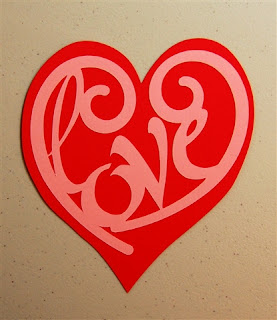
First I want to say that the "love in a heart" design above was created by "Carrie" and I got the file from the Cricut Softcuts Blog (be sure to check this out - see the link in the right column). I don't know her last name but want to be sure to give her credit for it! I loved the design and wanted to use it for a Valentine's Day project but I needed a shadow for it. The open heart is from Accent Essentials and does not have a blackout type shadow so I designed one by skewing and tweaking a George heart. Carrie's original design and the blackout background file are available here.
Love in a Heart - Shadowed
I did four shadows on page two and the original design is on page one - since we can't group and copy the elements of the designs with the current version of the software, I just cut one at a time and then rotated and restuck my paper to the mat to have an uncut area in the correct position for the next cut.
But back to the reason I started this post...
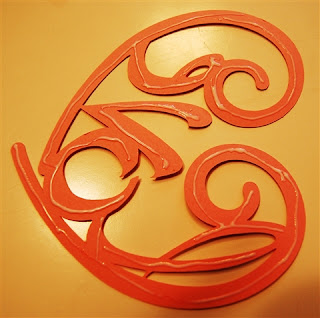
I don't like to see a delicate cut that looks messy because the design is not completely stuck down or the adhesive oozes out to the front of the design. I have found that the best solution for sticking down small cuts is the Creative Memories Precision Point Adhesive pen. I like the control you have with a pen style applicator. I believe there are other similar pens on the market but I have not tested them (as a CM consultant I got one of these when they first came out, loved it and didn't need to research any other types!)
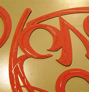
When using this type of adhesive I have found that it is important to apply a small amount on every line of the design. When the adhesive goes on it is a milky white color. It is very important to let the cut "rest" with the adhesive on it until the adhesive turns shiny and clear. Then, and only then, you can turn it over and apply to your page or card with no risk of goopy adhesive appearing on your work.
Here is how it looks when you first apply the adhesive
Here is how it looks when it is ready to stick to your project
I know this was a bit of a digression from posting my files but I thought it might be helpful - especially for anyone using a cut like my cakestand borders!
Monday, February 25, 2008
Florida Vacation Title
Here is another title for a scrapbook page from our family vacation in Florida - maybe you could use it for your Florida vacation or change it by inserting the name of the place you visited instead of Florida. Be careful - the dots on the "i"s are small and you have to be sure to save them to stick to your page!
Fun in Florida
Building Castles in the Sand
We are back from a wonderful Family Reunion in Florida. Our triplet nephews had so much fun playing in the sand and building castles and moats - I will do a layout with the photos but for now just wanted to share the file that I previewed in the last post (good thing I didn't put it up until I checked it as I had missed a couple of welds). This link should download directly - I am trying a new method for posting files thanks to the generous sharing of amkscrap on the Cricut Message Board.
Castle Builders
Tuesday, February 19, 2008
An explanation - new designs will be coming soon....
I know that some people have told me that they check in here everyday and I just wanted to let you know that I haven't stopped designing!
I am in Florida on a family reunion vacation and my Cricut is home in snowy Massachusetts. We are having a lot of fun (all 28 of us). I have spent some time (when I need to be out of the sun) working on designs to use with some of the photos from this trip but I don't want to put up files, photos, etc., until I can test cut and possibly refine my designs.
So check back in a few more days - meanwhile, here is a screen shot of one new design (to be used on a page with photos of my triplet nephews building in the sand).
Tuesday, February 12, 2008
Swirly Snowflake
I just can't stop playing with all the shapes and adding things to them! This is a very simple embellishment for the corner of a page or to put on a 5 x 7 card. It uses images from Joys of the Season - one of my favorite cartridges!
I hope you can use it and will be inspired to just try playing with the shapes on the cartridges.
Swirly Snowflake
Not really a doily, not really a snowflake - here I go being symmetrical again!
This is something I created using only Accent Essentials - just fooling around. I am not sure what to call it but I liked the end result - maybe it could be used on a page for a graduate showing choices for the future in each arrow with a photo in the center, a title of "Where do I go from here?" and the options in the arrows. Hmmm......I may try that....
Anyway, I liked the use of a full sheet of 12 x 12 with no waste! The offcut from this could also be used on a page, here is what it looks like:
and even the leftover "bits" could be put to use - 8 arrows and a circle:
So, if you like it, try it...
Not really a snowflake
Graduation is coming - before you know it!
Many of my friends and customers get involved in making a scrapbook for the first time for a significant birthday or anniversary or to honor someone for a graduation or retirement.
It's time to get started on those graduation books - the season will be here faster than seems possible on these cold snowy days (at least they are cold and snowy here in Massachusetts!)
This is a bit of fun I designed for a graduation book using Alphalicious and Beyond Birthdays.
Here is another photo showing it on a 12 x 12 page so you can get a sense of the size.
Here is the link - I did it two ways - one with diplomas and one without (which could be used for other occasions). Fair warning - I did not cut the one without diplomas but it was done first and then I did a "Save as" and added the diplomas for the second one so I am reasonably confident that the file is fine. When I get a chance I will double check it.
Doing the Happy Dance with diplomas
Doing the Happy Dance - no diplomas
Some "Fancy" borders made with cakestands
I kept looking at the cake stand on the Celebrations cart and thinking that it looked very cute and "girly" (since I have two - wonderful! - sons, I seem to be overly attracted to "girly stuff!)
So I tried welding them together to get a border for "fancy" pages. The example above is the first result.
Not satisfied with the "girly" factor I decided to add to it and fit in the open heart from Accent Essentials. There was some tricky welding but it was definitely fancier! Here is the resulting border:
Here are the two borders are at the top and the bottom of a page:
I also tried putting them together with a some of the black background showing like this:
I tried them close together and they looked like this:
The "leftover bits are also pretty and could be used - here are all the pieces:
These cuts are just placed on a black background for photographing and would be straighter if they were stuck down. For items this small, I use the CM precision point adhesive pen - I think there are other similar ones at craft stores. The important thing is to be able to control the flow of the adhesive. With the CM pen I have found that it is best to apply it lightly and then leave it sitting in the air until the white is gone and it just looks shiny. At this point, the adhesive is tacky, the delicate item will stick down very well and there will be no "oozing" of the adhesive.
Finally, these could be used on a page with a special matted photo in the center - like this:
These cuts require a very delicate hand in removing them from the mat -don't use your stickiest, newest mat to cut these or you will be unhappy!
Here are the links:
Single cakestand border
Fancier cakestand border
Where have I been?
I got started on this blog a week or so ago because I had so many ideas and wanted to share them all in a comprehensive way. I just started posting things I had designed or was working on for use with my customers in my Creative Memories business and in my custom scrapbooks that I make for others. I am flattered that so many people have come and looked at my creations and downloaded them. I also started to feel consumed by the process of designing, testing, writing and posting as I made things.
While I will try to keep up my posting on a very regular basis (because I keep getting more and more ideas and want to try and share them), there are times when I won't be able to post for a few days or more. This week I had my sister here visiting from New Jersey and we went to the Creative Memories Regional C0nvention over the weekend. It was great to have her here and there are so many wonderful new things coming from CM in the next months. I'll try to get a post up about the CM items but I think most people come here for Cricut and Design Studio cuts and that is my focus on this blog. If you have CM questions (and you do not already have a CM consultant) you can always contact me through my personal website. (click here or on the link in the right side column).
So my sister went home today and I have a bit more time to get back to the blog. I have been doing some designing over the past few days and finally have had a chance to test cut and photograph the things I have been working on. There will be several posts today to "catch up."
If you have been checking in and been disappointed that nothing new has appeared - thanks for your patience. You can subscribe to my blog by using the box in the right side column and then you will be notified when I put up something new.
More photo mats - put the words outside (no "burping" required)
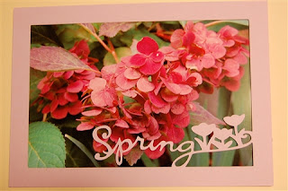
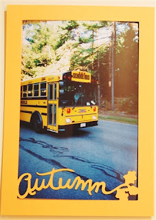
If you liked the "seasons" photo mats you may have already gone on and tried putting words on the outside like this. I just thought I'd post some examples, particularly for those who are new to the Cricut Design Studio software.
You can change the words (for example to "Mum" or "Pop") , change the fonts, change the shapes - do whatever you want and you won't need to "burp" these after you weld since the items are outside the frame. The vertical ones fit on a baby bug mat but the horizontal ones are a bit too big for the small mat - you could just weld your word to the short side of the photo mat to keep it on the 6 x 12 mat size.
NOTE: If you don't understand "burping," check out the helpful information in the Cricut Lovers Guide to Design Studio linked in "Some Favorite Places" in the right side column.
Add hearts, stars, flowers - whatever you like - these mats are sized to be perfect "overlays" for standard 4 x 6 photos.
Here are the links:
Vertical 4 x 6 Dad
Vertical 4 x 6 Mom
Horizontal 4 x 6 Dad
Horizontal 4 x 6 Mom
Wednesday, February 6, 2008
Four Seasons photo mats - take the concept and run with it!
I have been working on various designs that can be adapted for many different scrapbook pages or cards. When I do workshops or individual sessions with clients in my Creative Memories business and my custom scrapbooking work these will be useful and adaptable for many projects. I am trying to build frameworks that can be customized for particular situations.
I decided to try some photo mat overlays. I did an entire set with the openings at exactly 4 x 6 inches before checking and then realized that they needed to be slightly smaller since "4 x 6 photo paper" is not always exactly 4 x 6 inches. So I went back and adapted them, reducing the openings by just a bit to ensure full coverage. I do not want to post anything that I have not tested out first since that would not really be a time saver or help to anyone else if they had to repair my errors!
So, with many "burpings" to get the welding correct I have made horizontal and vertical versions of photo mats for the four seasons using the phrases from Stretch Your Imagination and George for the frames.
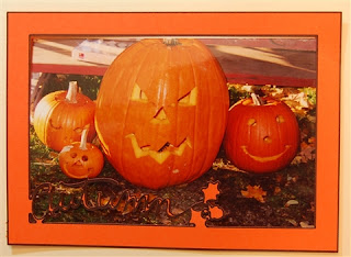
Here are some examples of how they look over a photo
I did try the markers again and did not care for the way the lines almost completely filled in the words - they also did not show up as clearly on the photo as you can see below:
Of course this would depend on the contrast to the area of the photo that the words overlay and I do like the way the markers look if you choose to use the overlay/mat for a journalling box instead of a photo, like this:
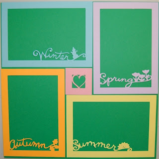
You could do a page with a photo for each season (two vertical and two horizontal) and even use the little 2 x 2 grid filler in the center like this:
Here they are with the opposite set of mats and a different center:
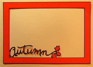
Once you have the .cut file you can go in and do a "Save as" and changed the decorative bit to a phrase, a shape, a name - anything you want. You can also move the decorative word or shape to a position that suits your photo the best. Just be sure to check "weld" and do a preview to see if the cut is correct. If it is not,"burp" the design to get the frame to work - just click on one of the frame rectangles and "copy" and "paste" it and pull it off to the side. Then delete that original rectangle and add the new one back in exactly the same place (you can check the positioning information in the upper right corner of the screen in Design Studio). Preview to check it and then Happy Cutting!
Here are the links for these mats:
Vertical Winter
Vertical Spring
Vertical Summer
Vertical Autumn
Horizontal Winter
Horizontal Spring
Horizontal Summer
Horizontal Autumn
An example of "Grid Fillers" in action
Someone asked me how I would use the grid fillers I posted a couple of days ago and so I put this layout together just to show an example - it isn't even adhered yet but I thought this photo might be helpful for visual people - it is a bit hard to explain in words. The light orange box in the lower right would be for journalling. I hope this helps. More about the "Autumn" photo mat in the next post.
Words on the Walls
One of the first things I wanted to do after I got my Cricut was to cut adhesive vinyl and put words and decorations on the walls in my house. I was inspired by a post on the Cricut message board that I saw shortly after I started using my machine. The post was of a very colorful craft room done by Alene, known as "lovemypoodle" on the message board and words can't explain how cute it is - you just have to go to this post to check it out! L@@K my craft room with CRICUT cuts!!
I started off on a much smaller scale and just wanted to put a Christmas phrase on the beam between our kitchen and family room for the holidays. I used Plantin Schoolbook at 3 inches and cut the letters out of dark red "Wall Pops". "Wall Pops" is a brand of adhesive back vinyl that come in about a dozen colors in either 13 inch squares, 13 inch circles or rolls that are 6 1/2 inches by 16 feet. They are sold at wallpaper stores, college bookstores and many, but not all, Lowes stores. At Lowes the regular price is $9.99 for a pack of five squares or five circles or a roll. You can find out more about them and the colors available and sales locations at the Wall Pops website
Here is a photo of the beam with the words
I cut sections of the vinyl that were 12 inches long and stuck it to the left side of the mat and then navigated to the corner using the arrows around the cut button and pushed "set paper size." I had my blade depth at 4, the pressure and speed dials at medium. It cut beautifully - cleanly cutting the vinyl but leaving the backing pretty much intact so I could just peel the letters off and place them one by one. The holly at the end was something I had already cut from paper using the Stretch Your Imagination cartridge and since I didn't have a "Christmas" shade of Wall Pops green I used tape to stick those up at the end.
I have not tried other brands of vinyl yet, including the new Cricut vinyl, but there are many other brands and nearly any color you want is available somewhere. You do want to be careful to make sure that the vinyl has repositionable adhesive that won't damage your walls.
After the holidays, I carefully took the letters down and stored them on some old office page protectors so that I can use them next year. They seem to stay very sticky so I hope they'll be usable for several years before I'll need to cut more.
I didn't have Design Studio yet so I just used the regular Cricut system and had it on "paper saver" - I have read that others have been able to squeeze lots of letters in for their words by using Design Studio to lay them out - just keep track of the letters as you place them so you have enough of everything! Below is the "waste piece" from my new saying for the beam...
It is important to smooth the material down to the mat very well and to make sure that all the air bubbles are out so that you will get good cuts with no shifting - some people have actually used sandpaper to rough up the backing sheet and make it stick down better.
For the next saying I used the Alphalicious cartridge - also at 3 inches. It was a bit more challenging to get such a long saying up in a way that I liked but you can keep repositioning things until you approve of the result! Here are a few photos of my beam right now - it will change when I feel the need for something new (or maybe for another holiday).
close ups
and the whole thing...
Check out the Cricut message board to see lots of other examples of funny and nice things that people are putting on their walls.
I started off on a much smaller scale and just wanted to put a Christmas phrase on the beam between our kitchen and family room for the holidays. I used Plantin Schoolbook at 3 inches and cut the letters out of dark red "Wall Pops". "Wall Pops" is a brand of adhesive back vinyl that come in about a dozen colors in either 13 inch squares, 13 inch circles or rolls that are 6 1/2 inches by 16 feet. They are sold at wallpaper stores, college bookstores and many, but not all, Lowes stores. At Lowes the regular price is $9.99 for a pack of five squares or five circles or a roll. You can find out more about them and the colors available and sales locations at the Wall Pops website
Here is a photo of the beam with the words
I cut sections of the vinyl that were 12 inches long and stuck it to the left side of the mat and then navigated to the corner using the arrows around the cut button and pushed "set paper size." I had my blade depth at 4, the pressure and speed dials at medium. It cut beautifully - cleanly cutting the vinyl but leaving the backing pretty much intact so I could just peel the letters off and place them one by one. The holly at the end was something I had already cut from paper using the Stretch Your Imagination cartridge and since I didn't have a "Christmas" shade of Wall Pops green I used tape to stick those up at the end.
I have not tried other brands of vinyl yet, including the new Cricut vinyl, but there are many other brands and nearly any color you want is available somewhere. You do want to be careful to make sure that the vinyl has repositionable adhesive that won't damage your walls.
After the holidays, I carefully took the letters down and stored them on some old office page protectors so that I can use them next year. They seem to stay very sticky so I hope they'll be usable for several years before I'll need to cut more.
I didn't have Design Studio yet so I just used the regular Cricut system and had it on "paper saver" - I have read that others have been able to squeeze lots of letters in for their words by using Design Studio to lay them out - just keep track of the letters as you place them so you have enough of everything! Below is the "waste piece" from my new saying for the beam...
It is important to smooth the material down to the mat very well and to make sure that all the air bubbles are out so that you will get good cuts with no shifting - some people have actually used sandpaper to rough up the backing sheet and make it stick down better.
For the next saying I used the Alphalicious cartridge - also at 3 inches. It was a bit more challenging to get such a long saying up in a way that I liked but you can keep repositioning things until you approve of the result! Here are a few photos of my beam right now - it will change when I feel the need for something new (or maybe for another holiday).
close ups
and the whole thing...
Check out the Cricut message board to see lots of other examples of funny and nice things that people are putting on their walls.
Monday, February 4, 2008
One more set of Grid fillers - more troubles with George!
So here is the last set of grid fillers I have done so far - these are done in George using the silhouette feature and, once again, George is giving me angst!
For some reason the silhouette causes trouble and does not cut evenly - if you read my long sad tale about the doily design from February 1, you will know something about this. However - I do believe that the file will be OK for you to cut if your George cartridge is not acting up on you!
Same old problem with off center cuts on silhouette - made even worse by the small size and the use of markers - you can see here...
So, no guarantees - and let me know if yours works out as planned - I think I will abandon George on silhouette for the time being. I did think these would be nice as overlays for a photo if your subject was centered nicely in the shape.
Grid fillers with silhouette shapes